Beautiful UI Blocks
Copy-paste ready components built with React, Tailwind CSS, and shadcn/ui. Fully responsive, accessible, and customizable.
137+
Blocks
27
Categories
100%
Free
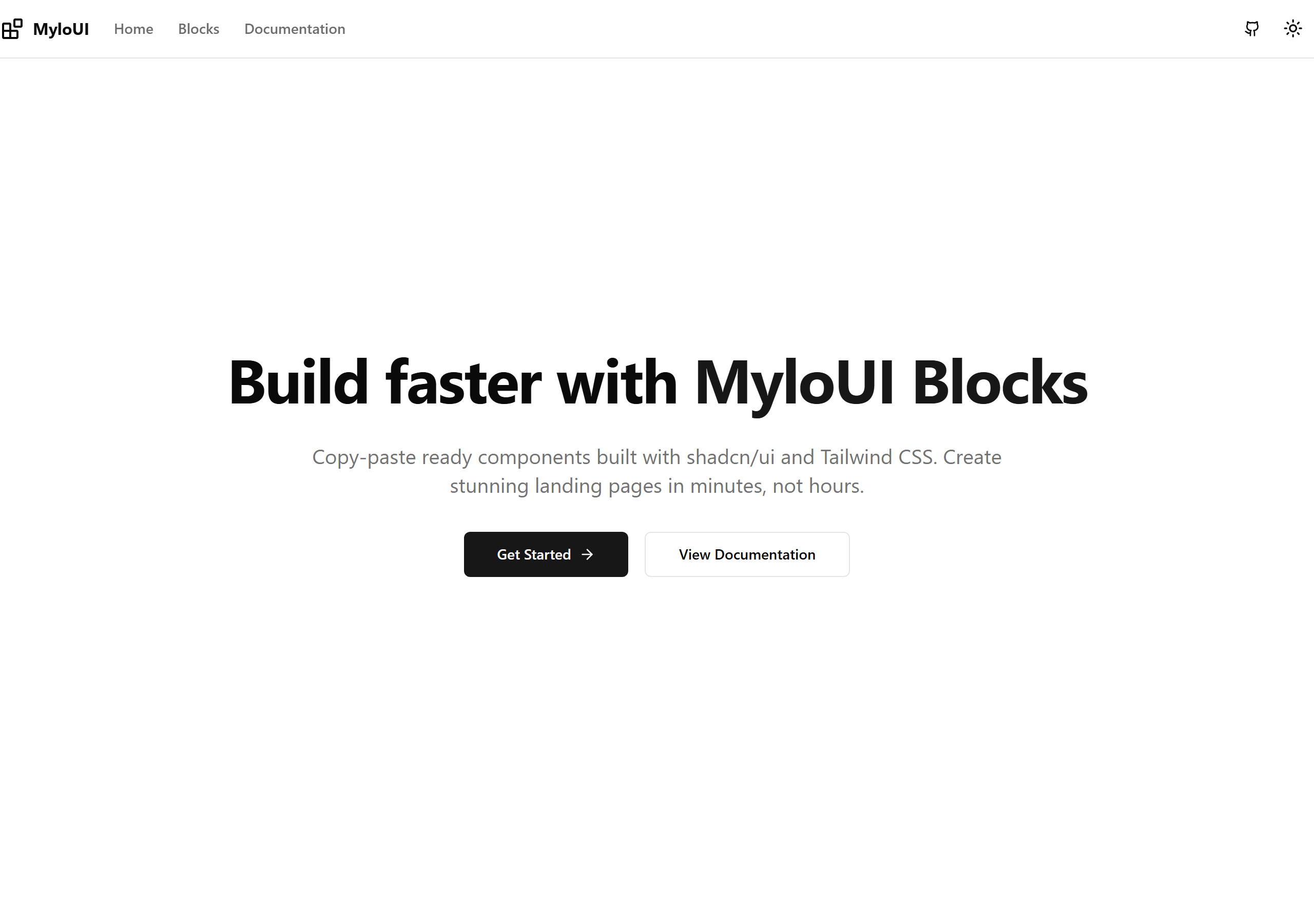
Centered Hero
A centered hero section with headline, subheadline, and dual CTAs
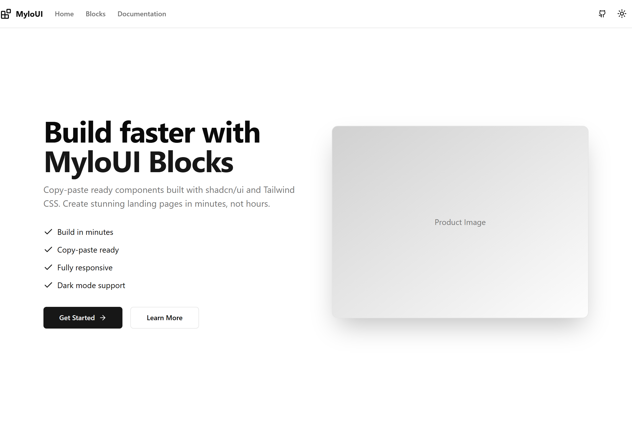
Split Hero
A hero section with split layout for text and image
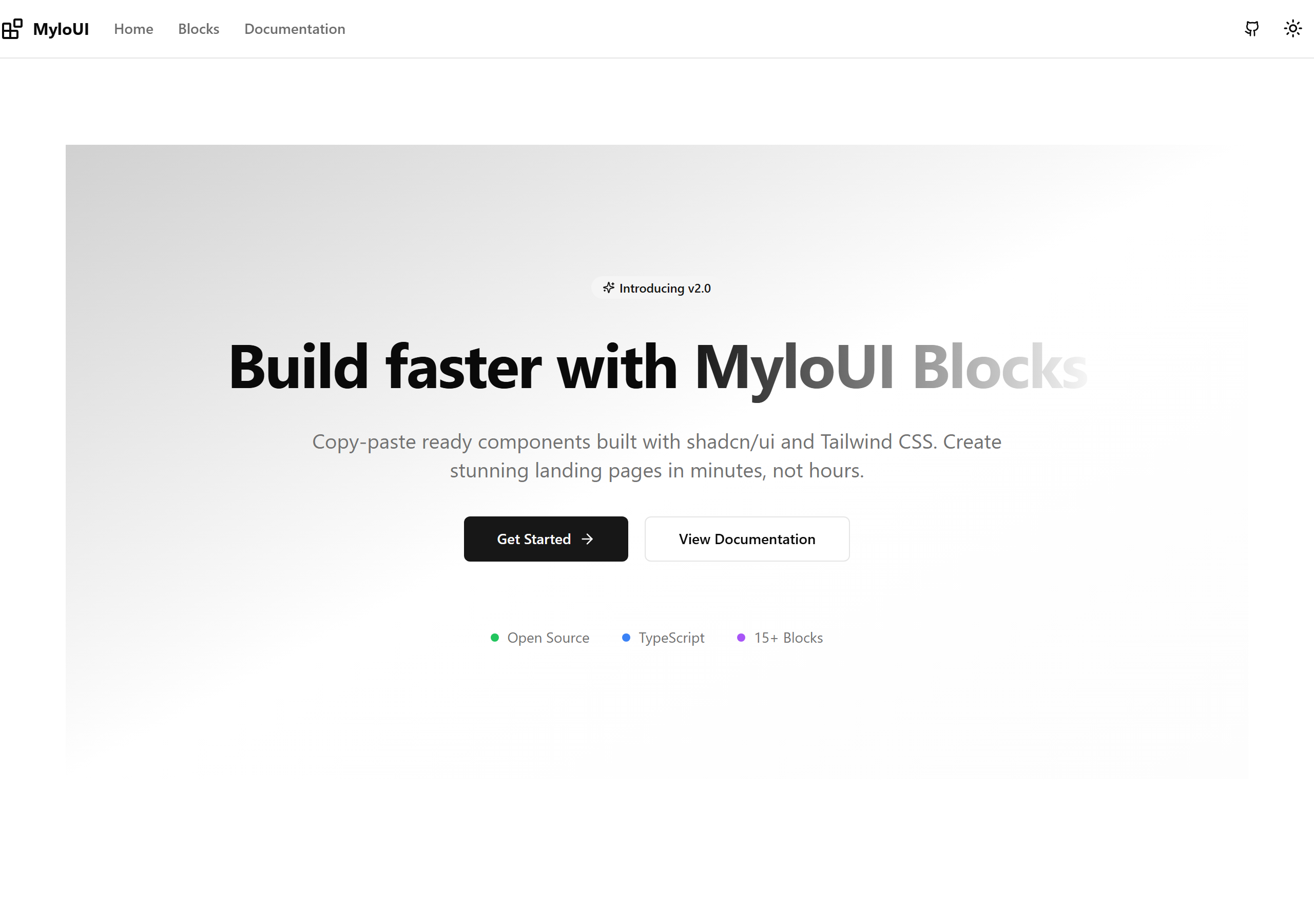
Gradient Hero
A hero section with gradient background and centered content
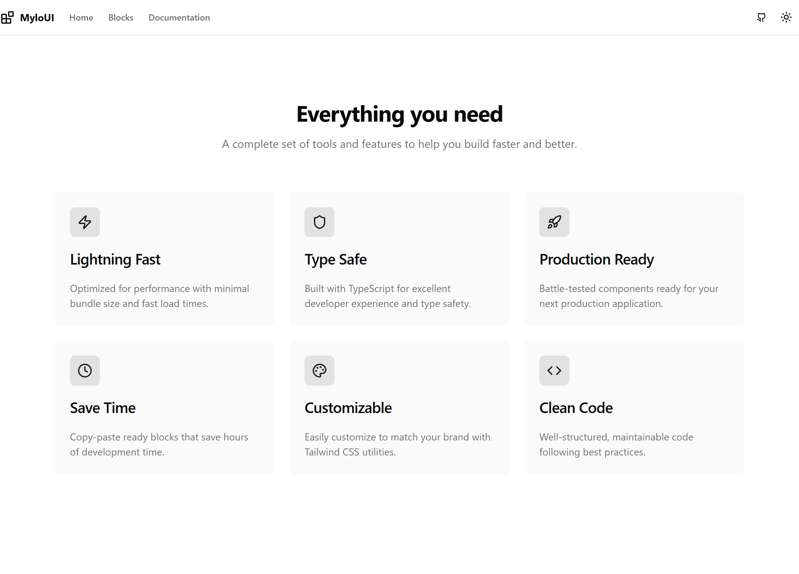
Features Grid
A grid layout for showcasing features with icons
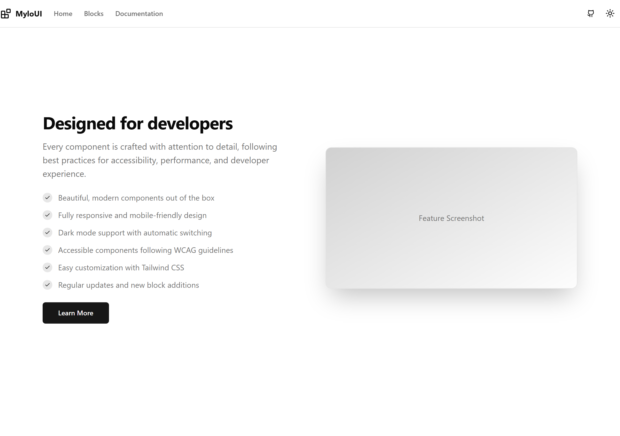
Features with Image
A feature section with large image and text content
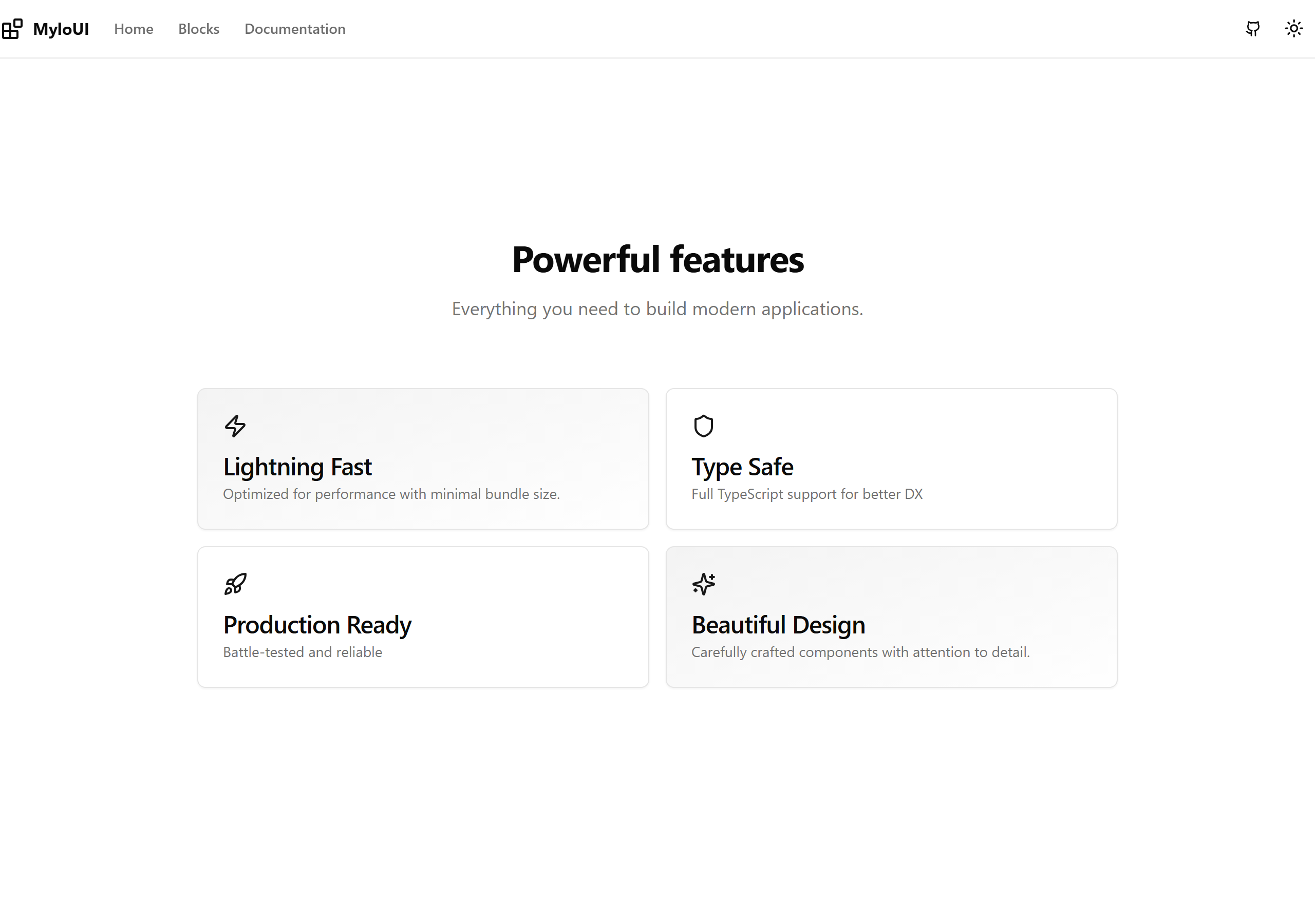
Bento Features
A bento-style grid layout for showcasing features
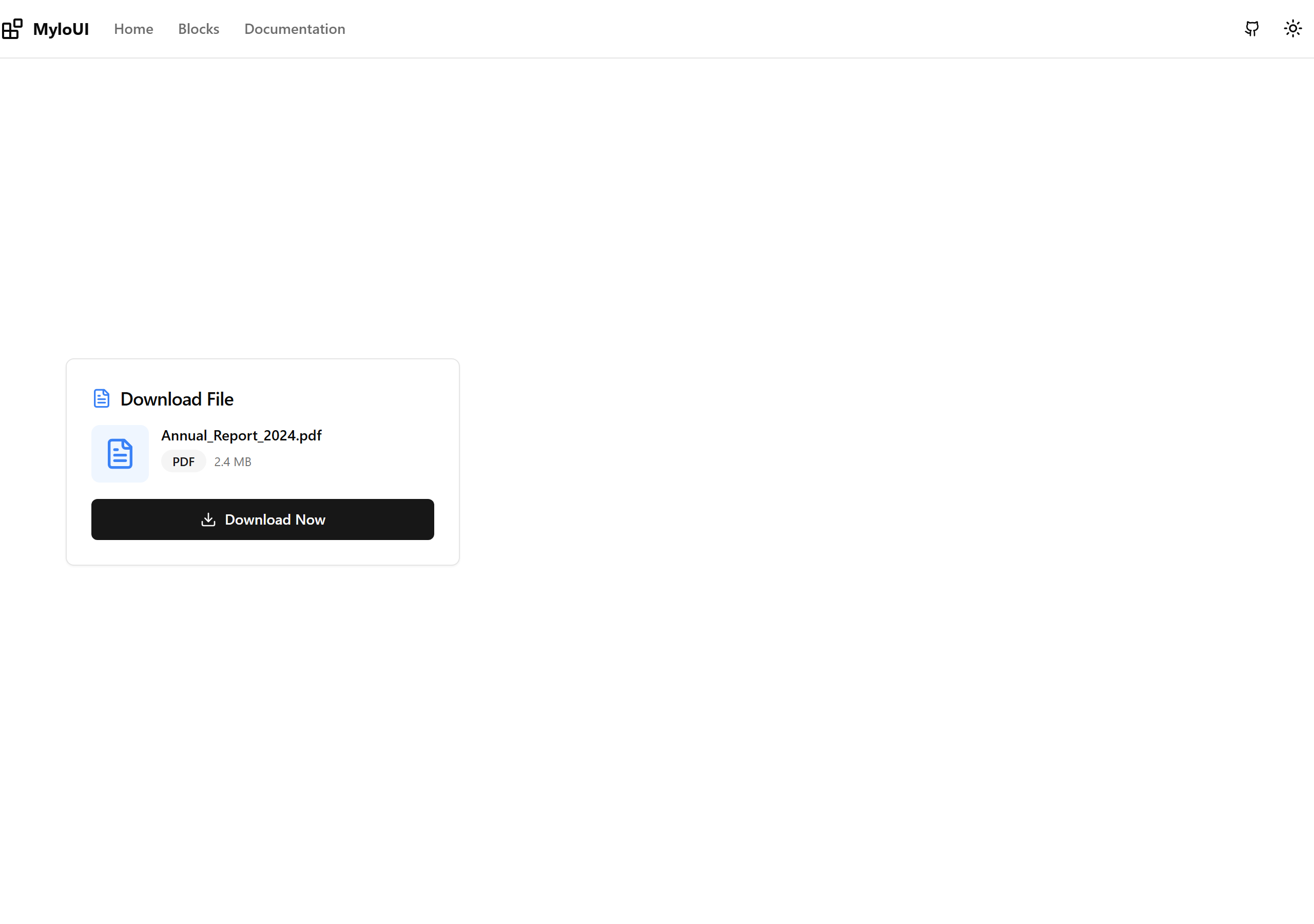
Simple Download Card
Clean, minimal download card with file info and download button
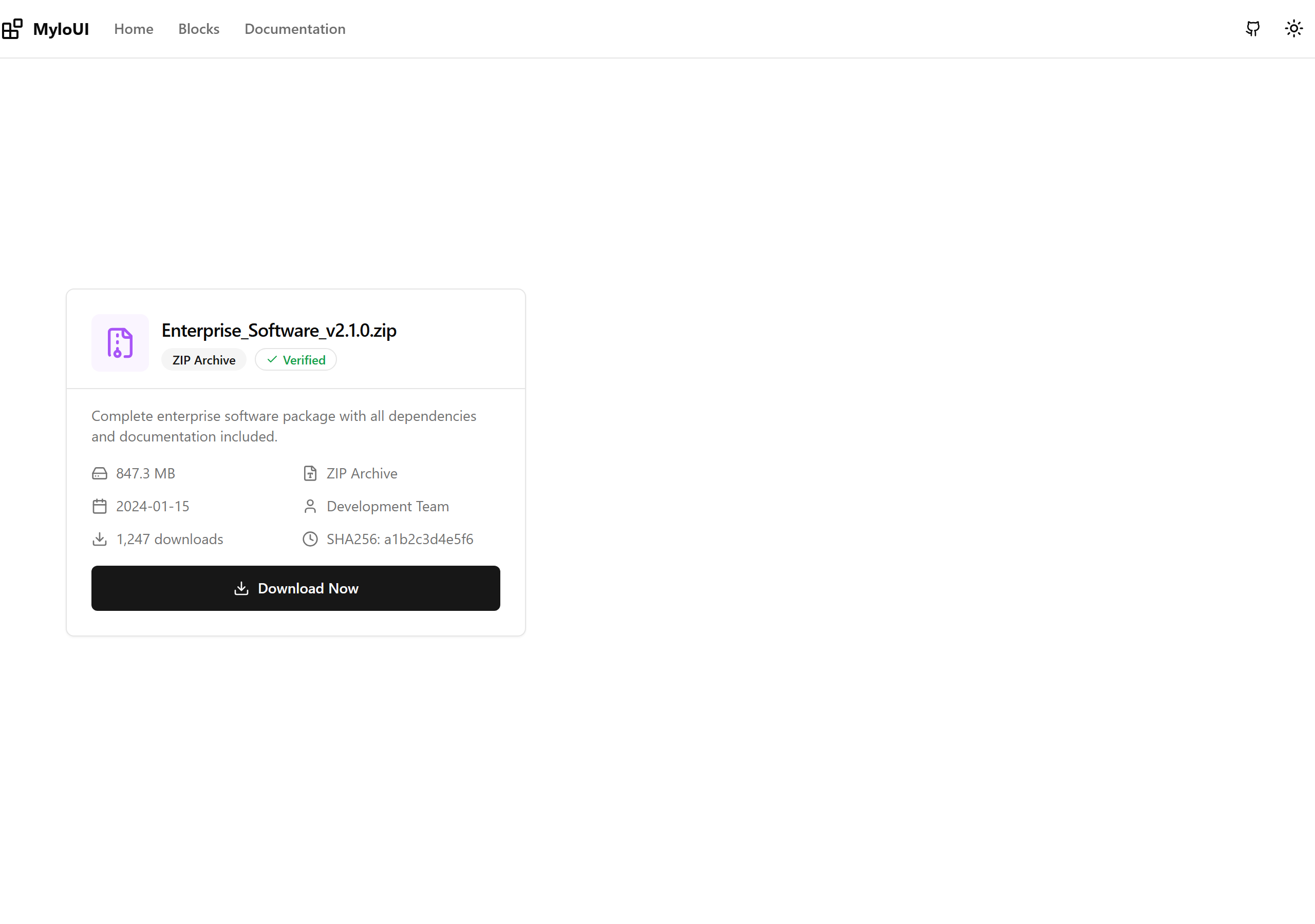
Detailed Download Card
Comprehensive file metadata: size, type, date, author, checksum
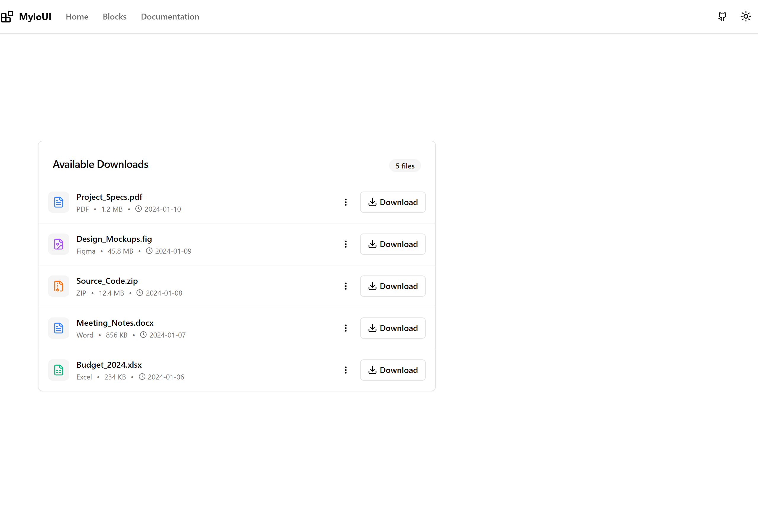
Download List
Multiple files in scannable list format with quick actions
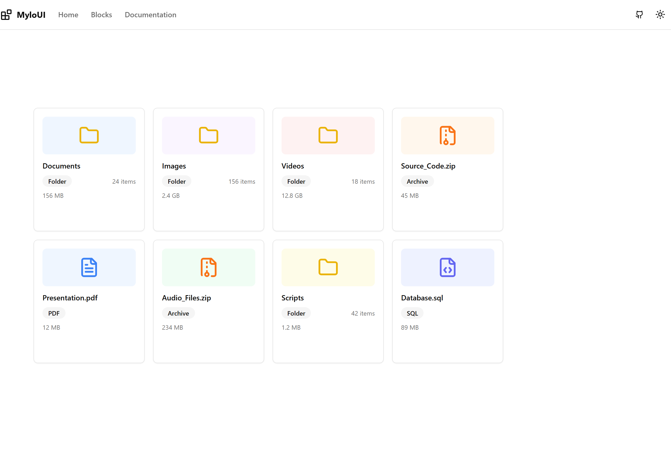
Download Grid
Responsive card grid for file galleries and asset libraries
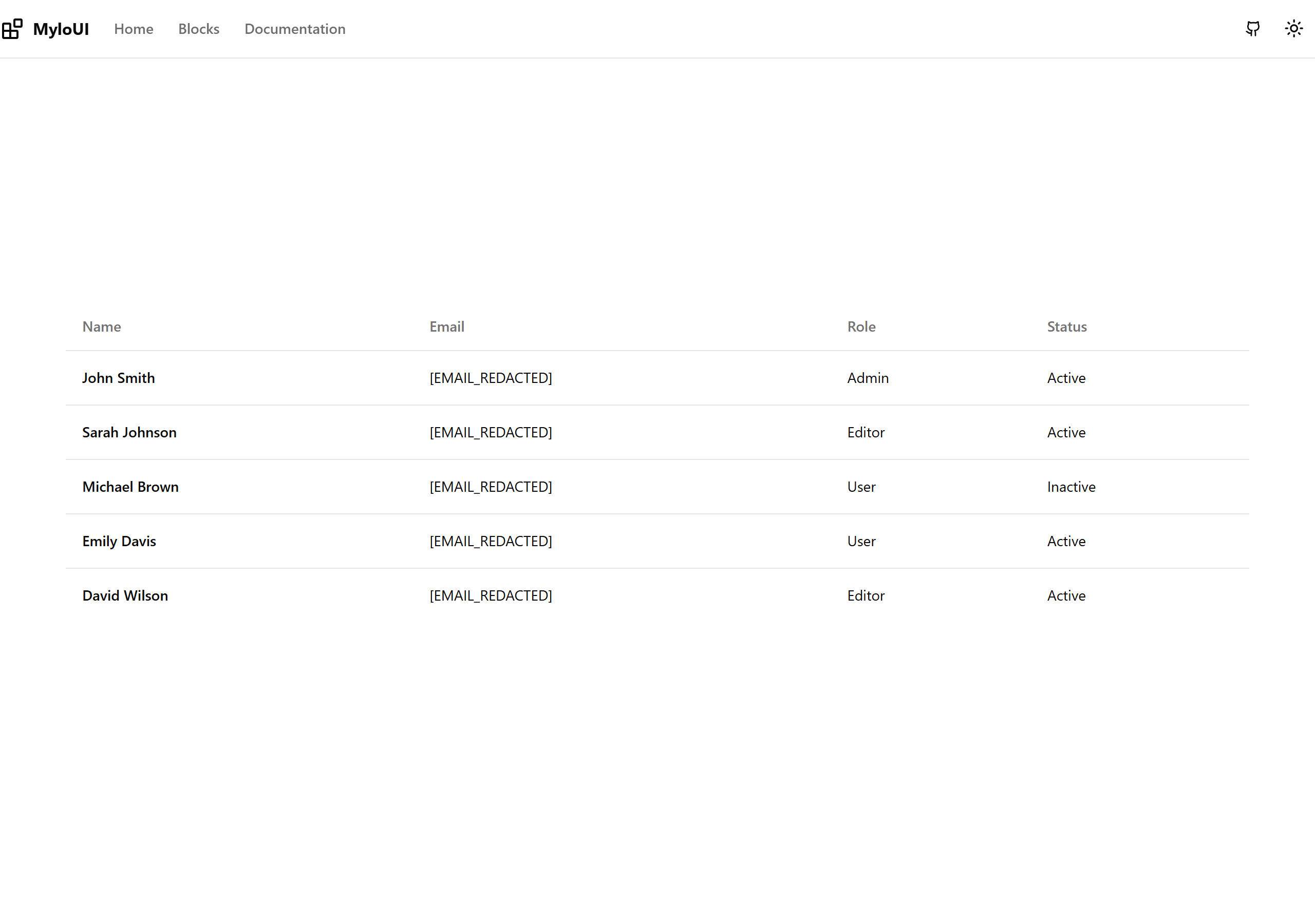
Simple Table
Clean, minimal table with basic data display
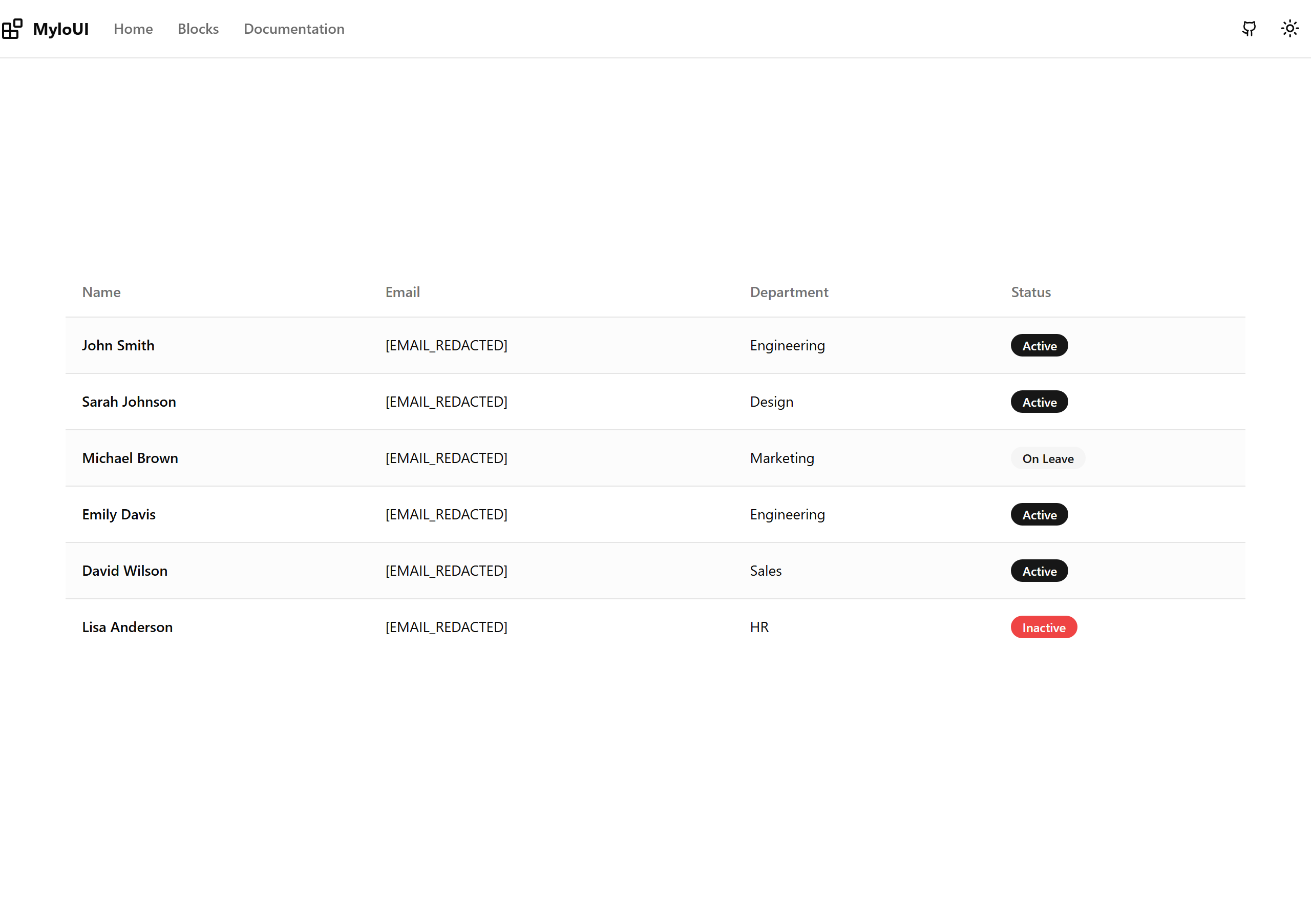
Striped Table
Alternating row colors with status badges
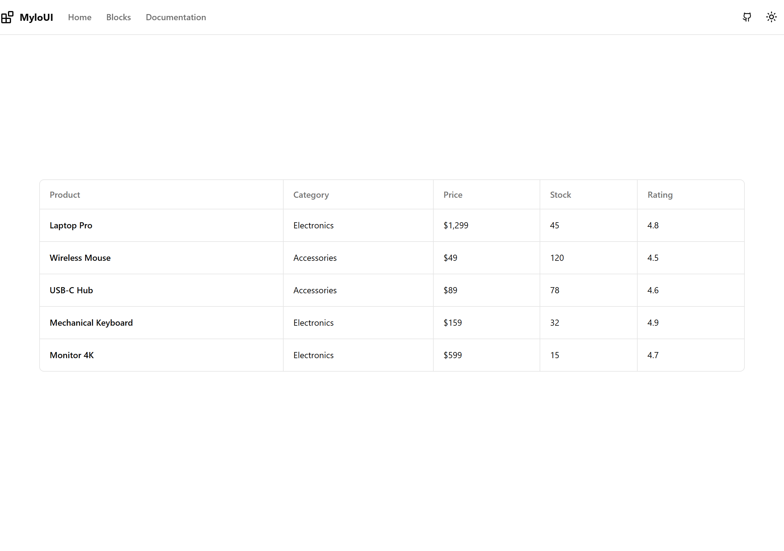
Bordered Table
Grid-style table with visible borders
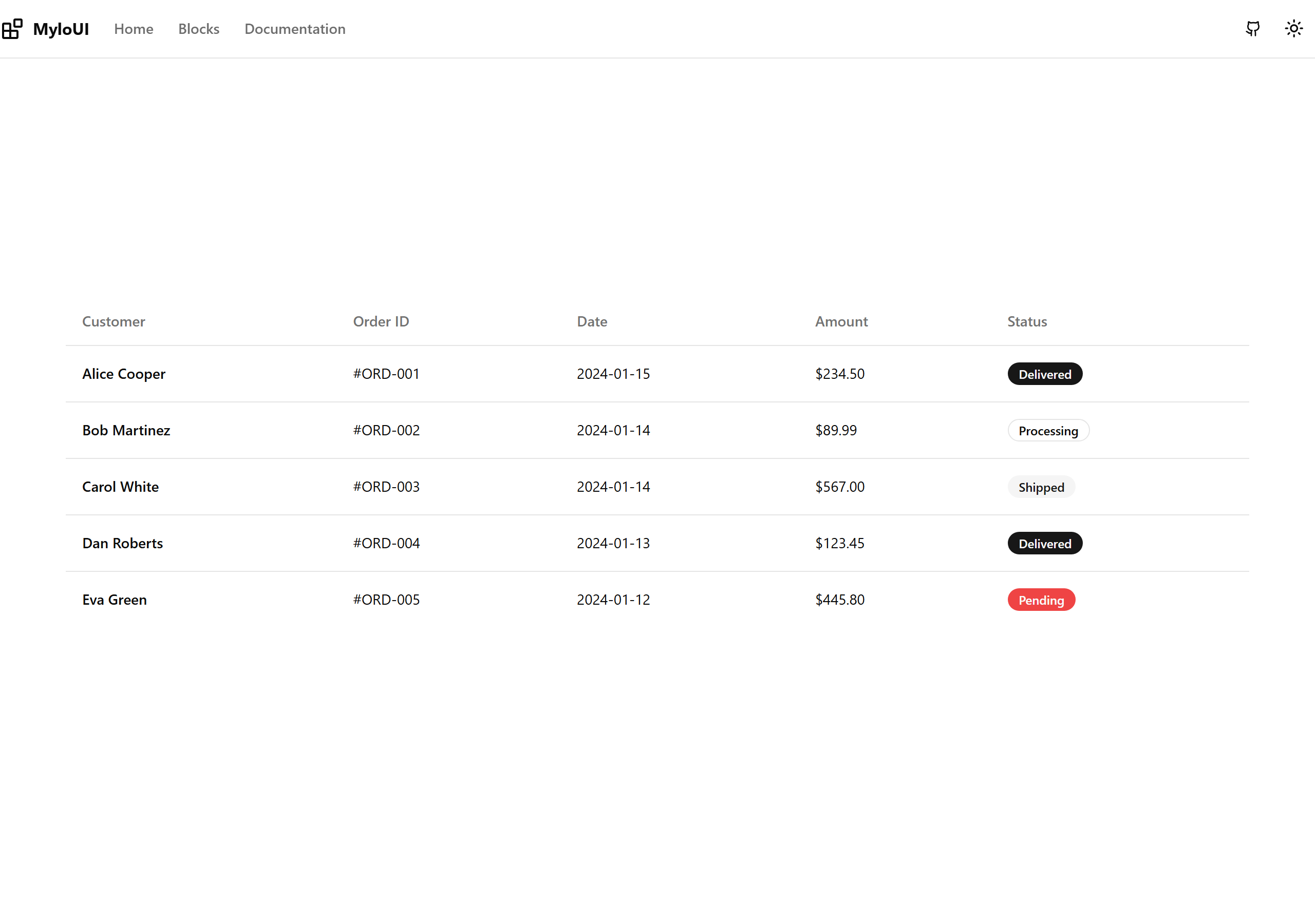
Hover Table
Row highlighting on hover with order status
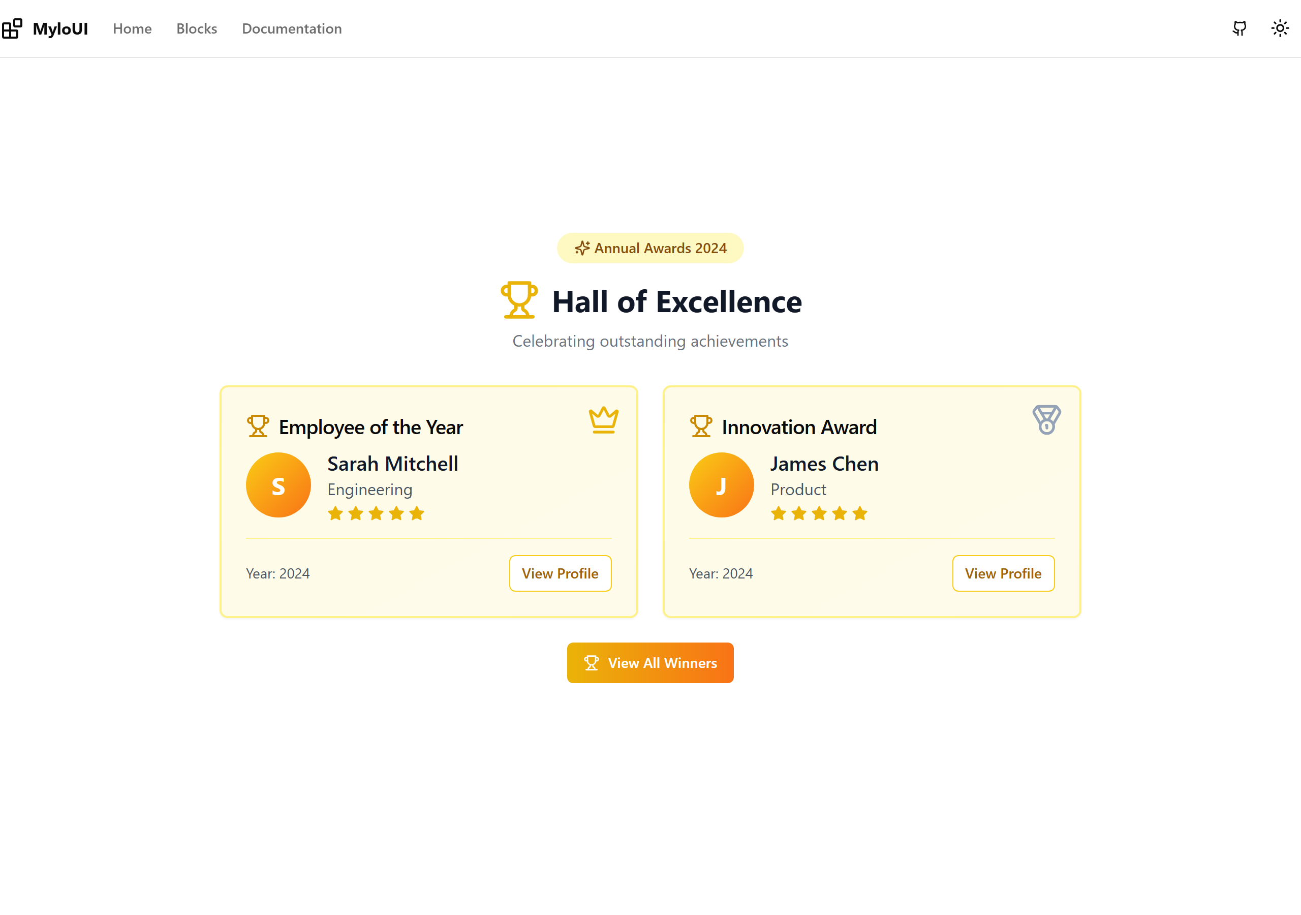
Trophy Display
Large trophy cards with winner info, star ratings, year display
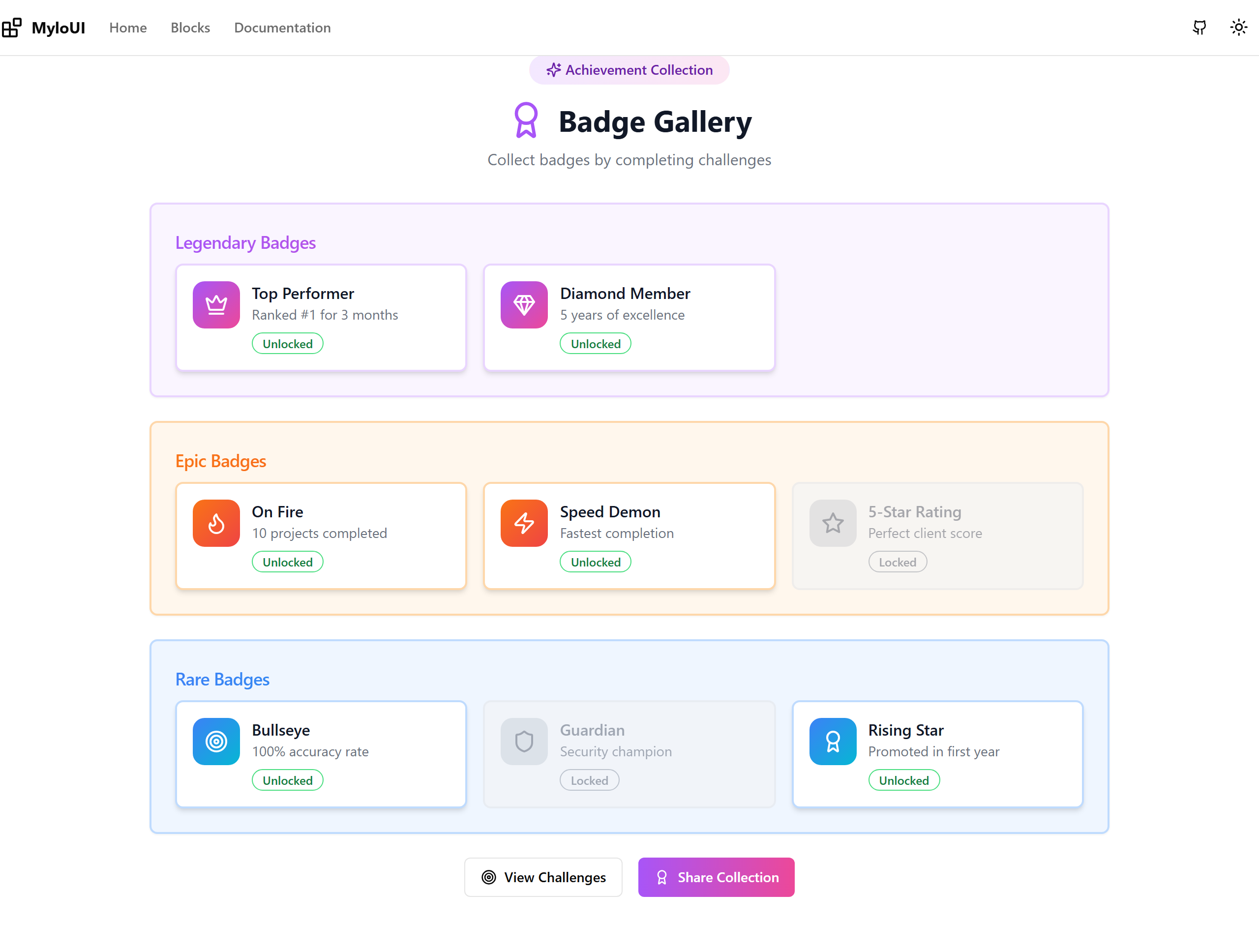
Achievement Badges
Rarity-based badges (Legendary, Epic, Rare) with unlock status
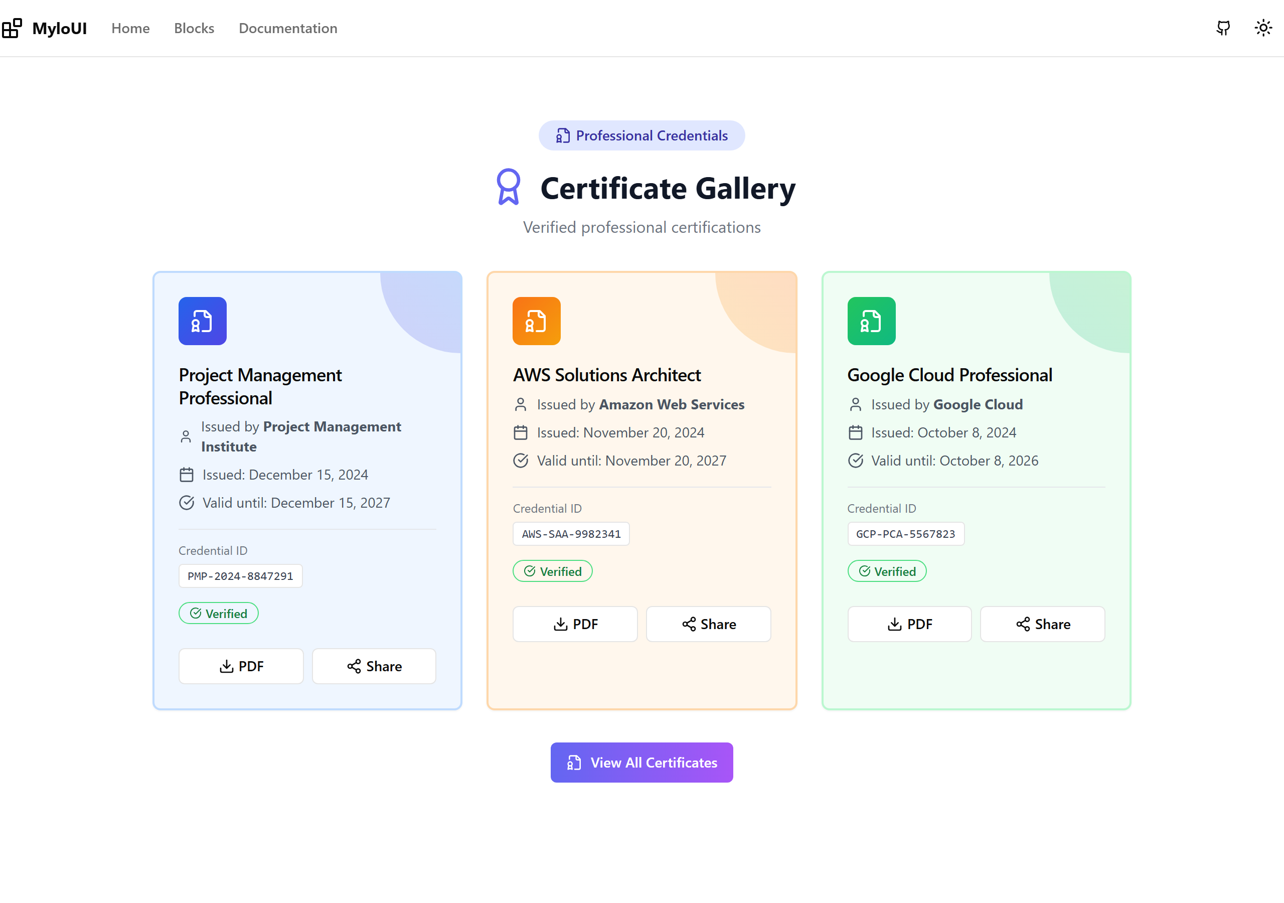
Certificates
Professional certificate cards with issuer info and verification
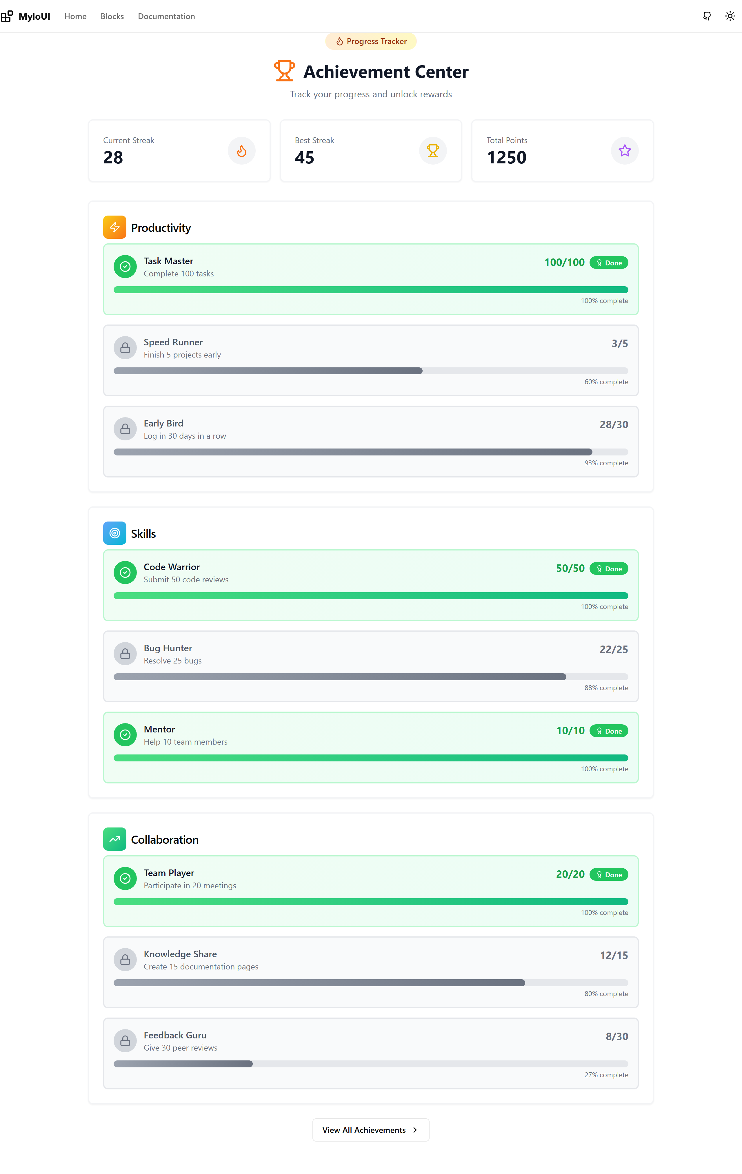
Achievements
Progress bars with percentages, streak counters, locked/unlocked states
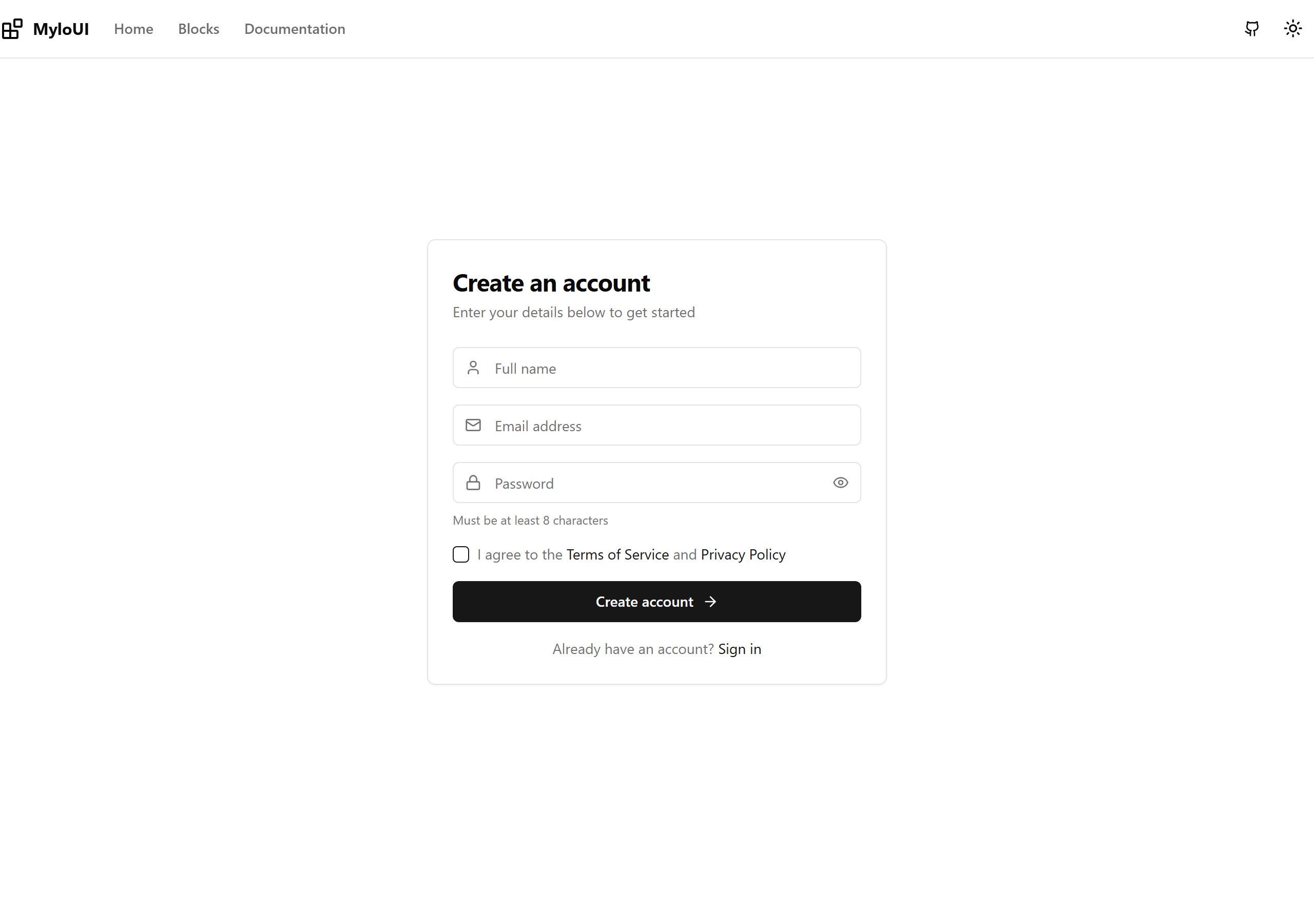
Simple Signup
Basic email/password form with name, email, password fields
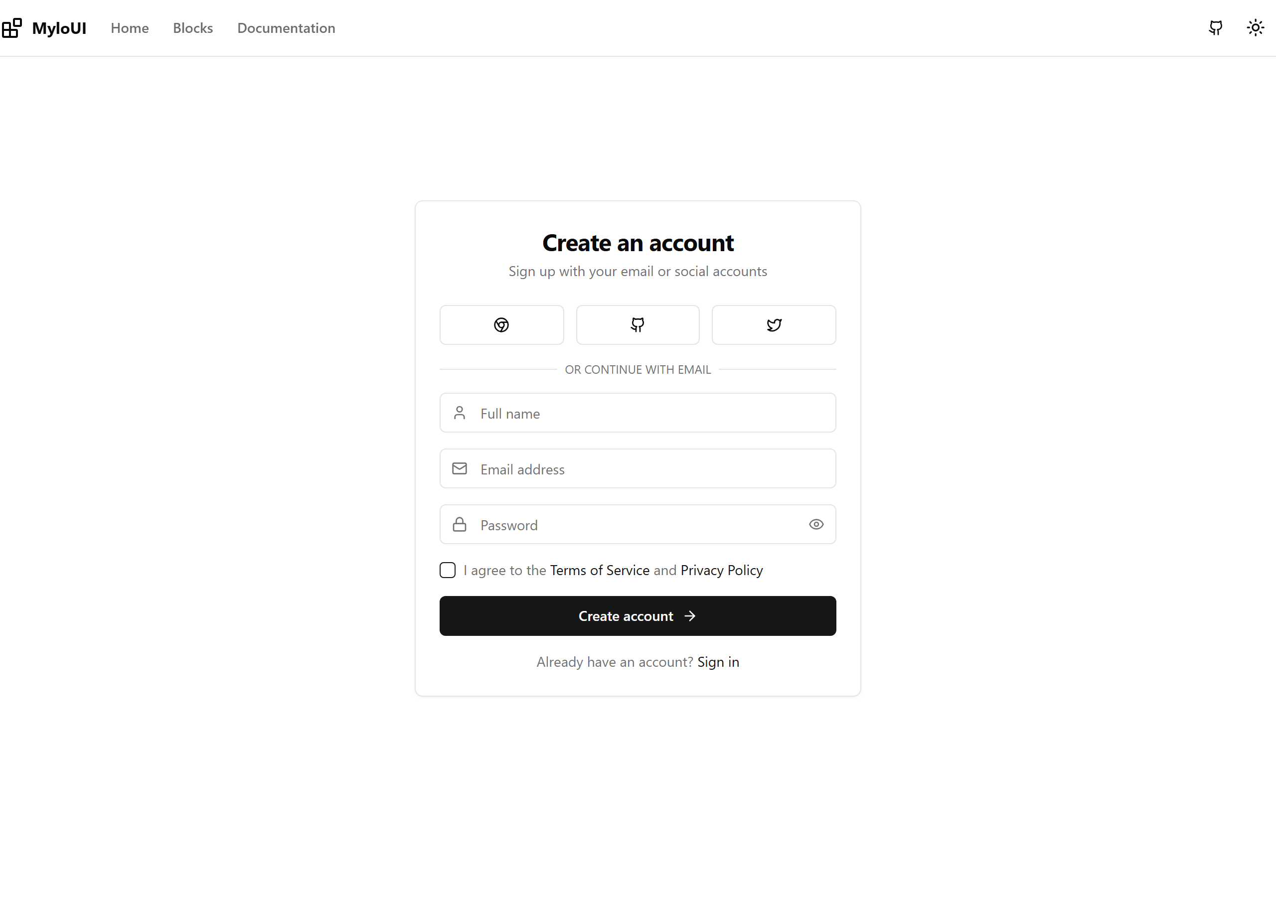
Signup with Social
Signup with Google, GitHub, Twitter social login options
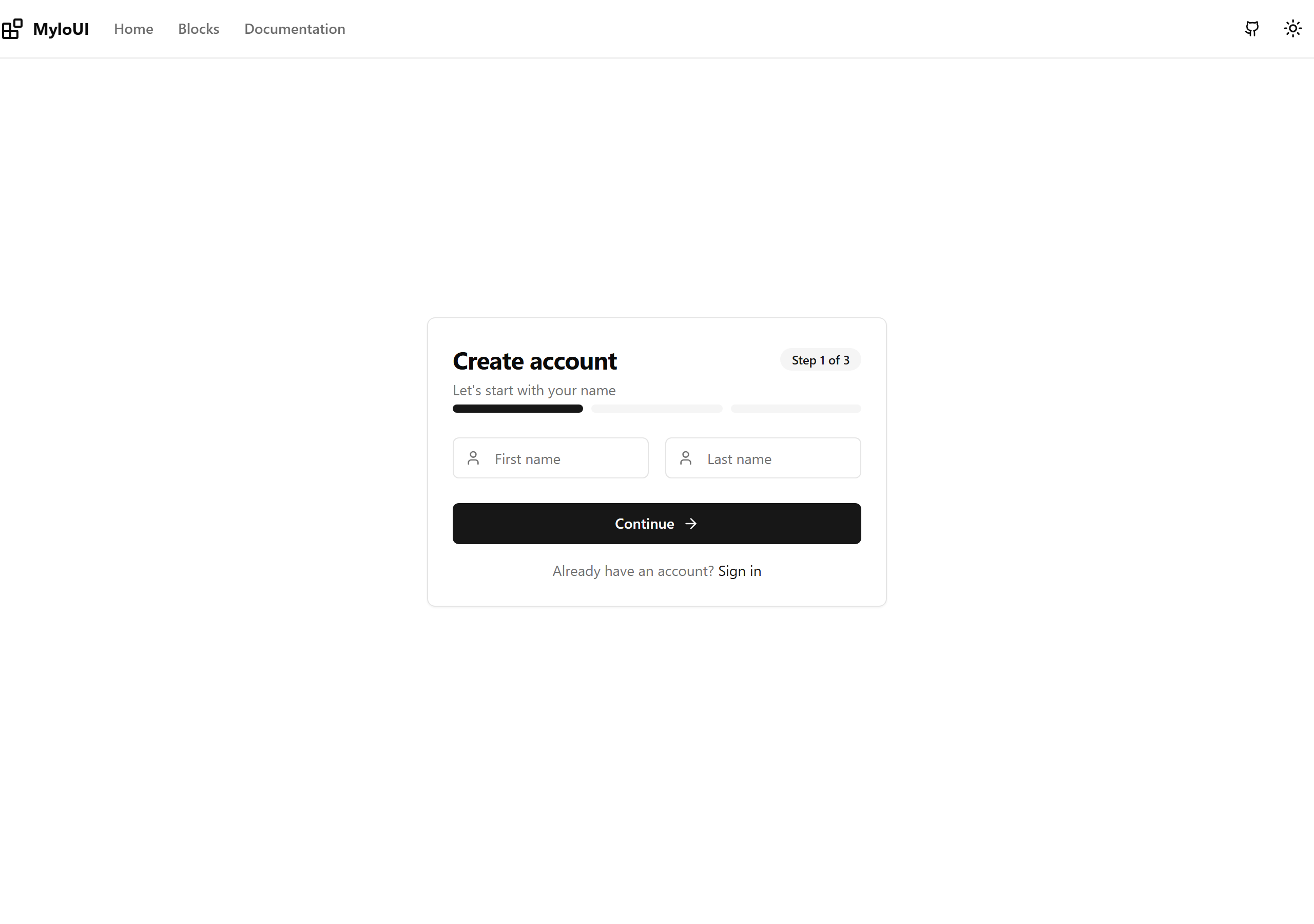
Multi-Step Signup
3-step wizard with progress bar
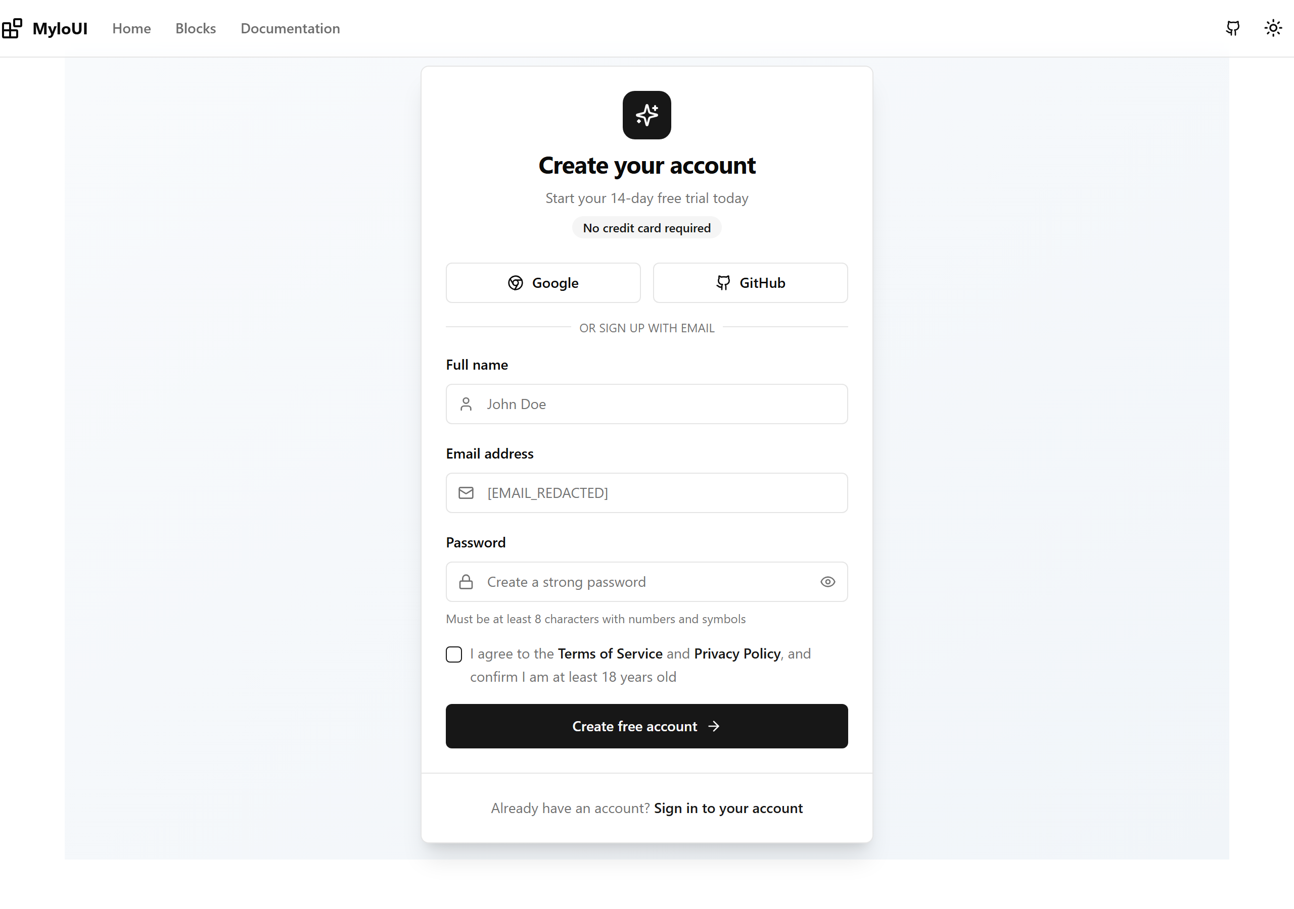
Signup Card
Centered card layout with gradient background
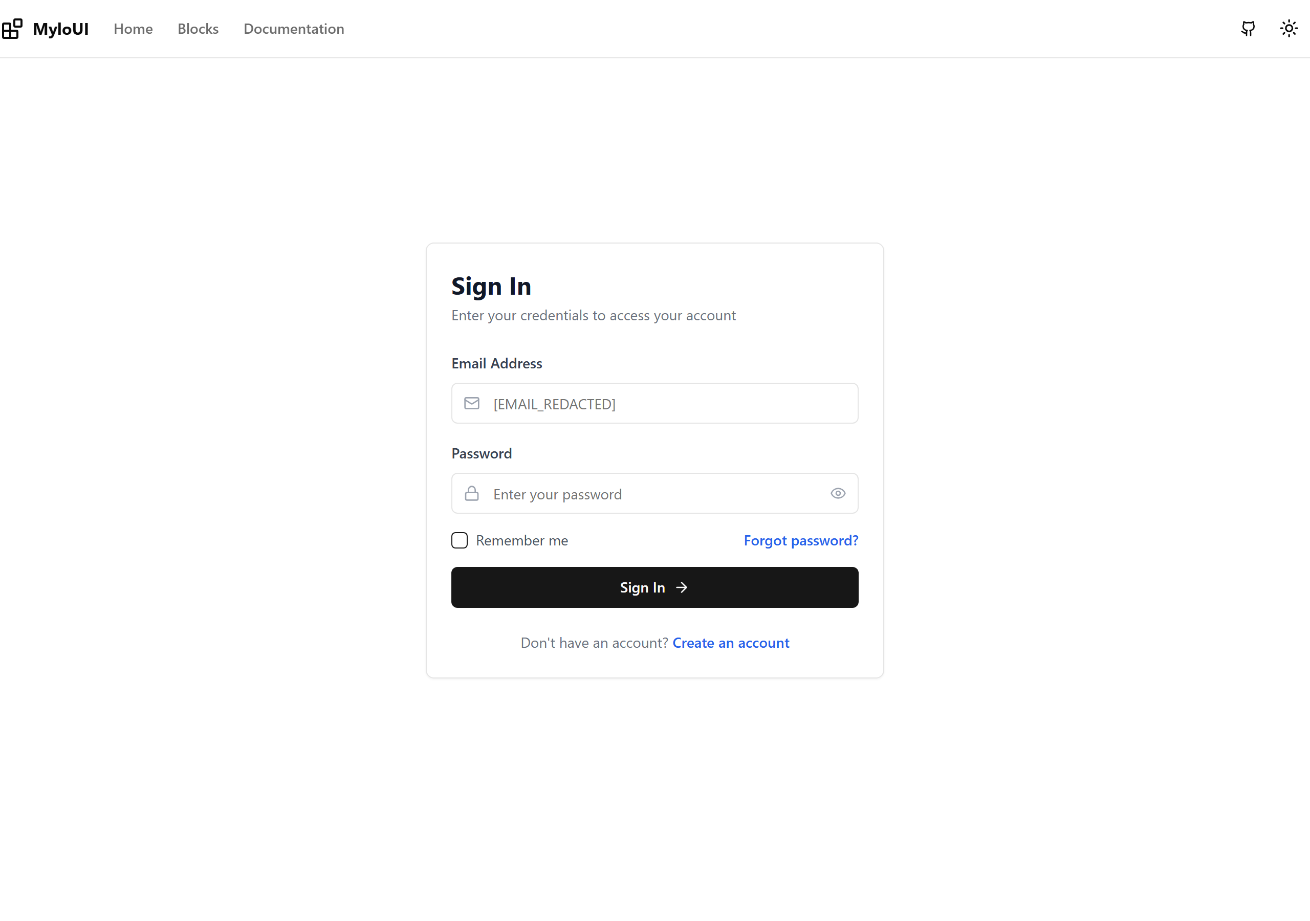
Simple Login
Basic email/password form with clean validation states
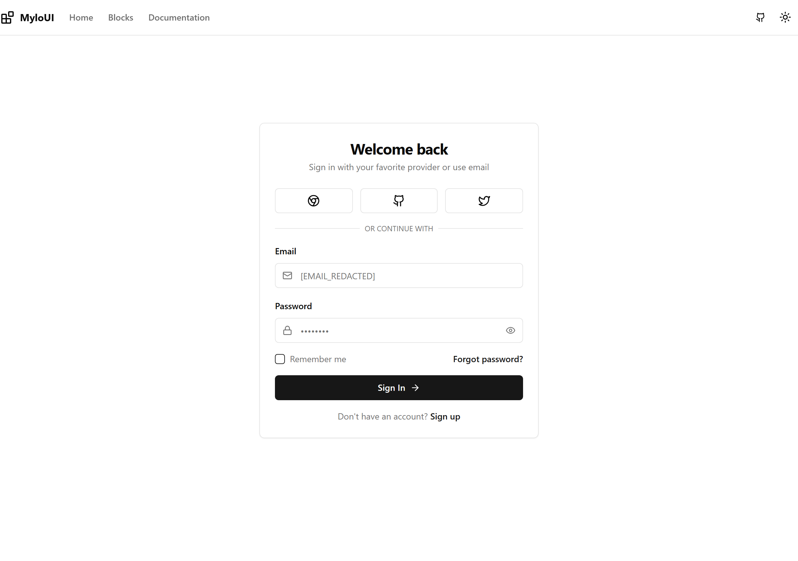
Login with Social
Login with Google, GitHub, Twitter social buttons
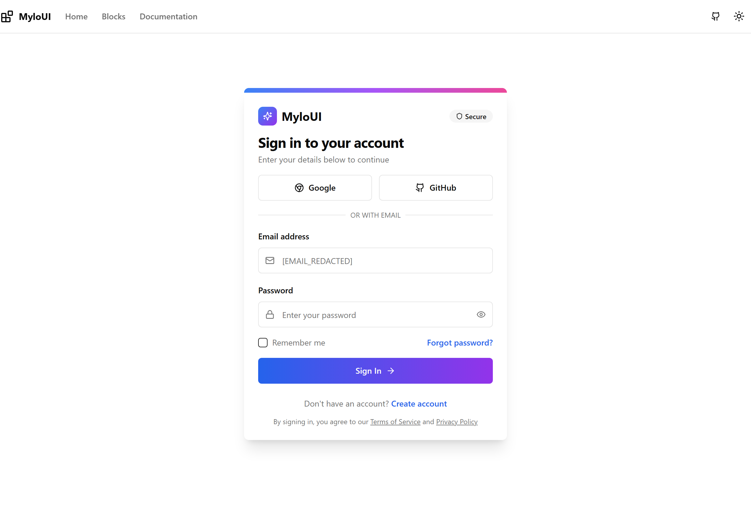
Login Card
Centered card layout with gradient header

Split Login
Full split-screen layout with image/gradient sidebar
Line Chart
Line chart with dual series support for trends over time
Bar Chart
Bar chart for comparing values across categories with target comparison
Pie Chart
Pie chart showing part-to-whole relationships with breakdown
Area Chart
Area chart with gradient fills for showing cumulative data over time
Sidebar Navigation
Collapsible sidebar with navigation items, search, and user profile
Header Navigation
Responsive header with nav links, search, notifications, and user menu
Dashboard Layout
Complete dashboard with stats cards, activity feed, and task list
Settings Layout
Settings page with sidebar navigation and organized sections
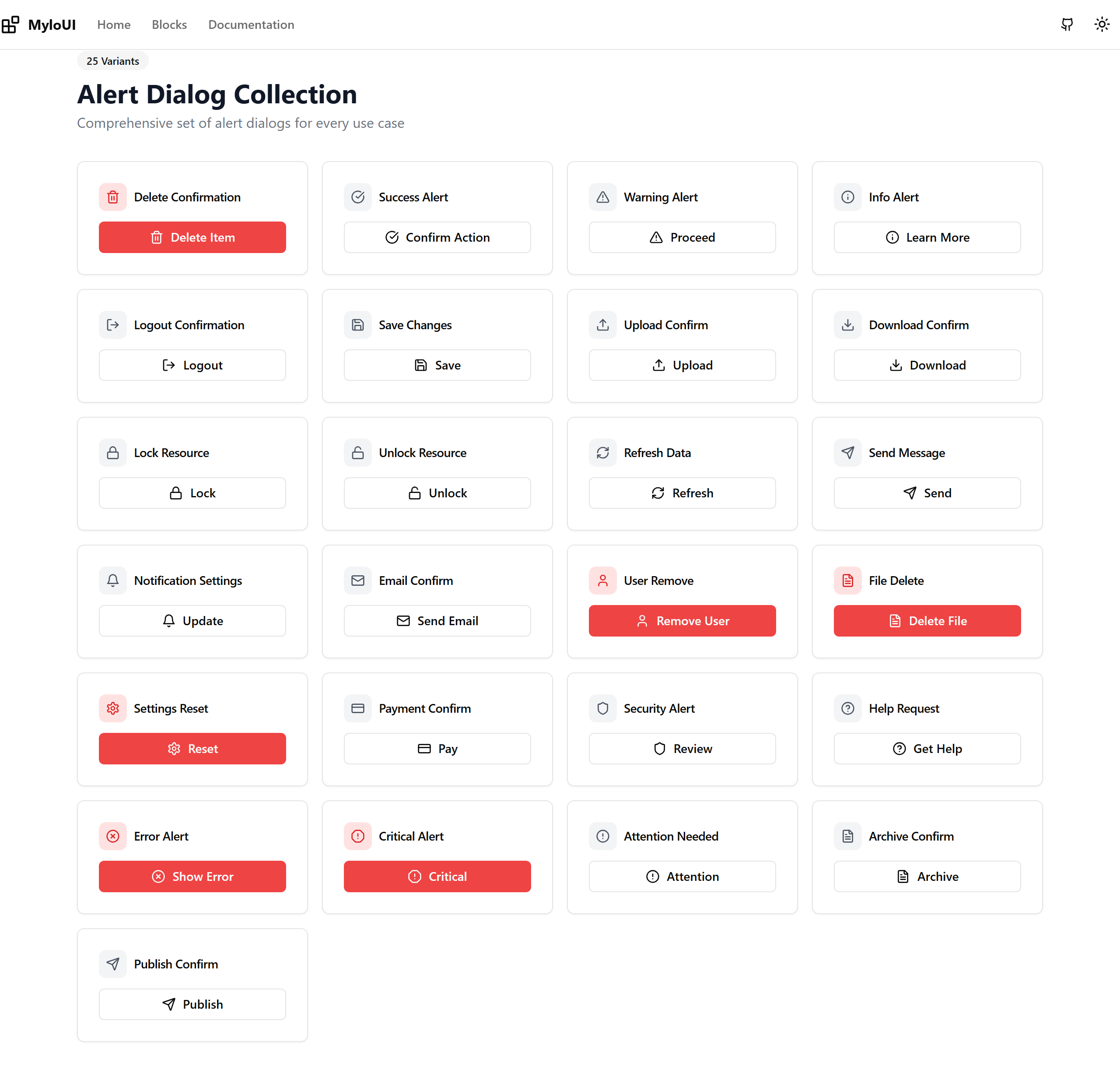
Alert Dialog Variants
25 different alert dialog variants for various use cases
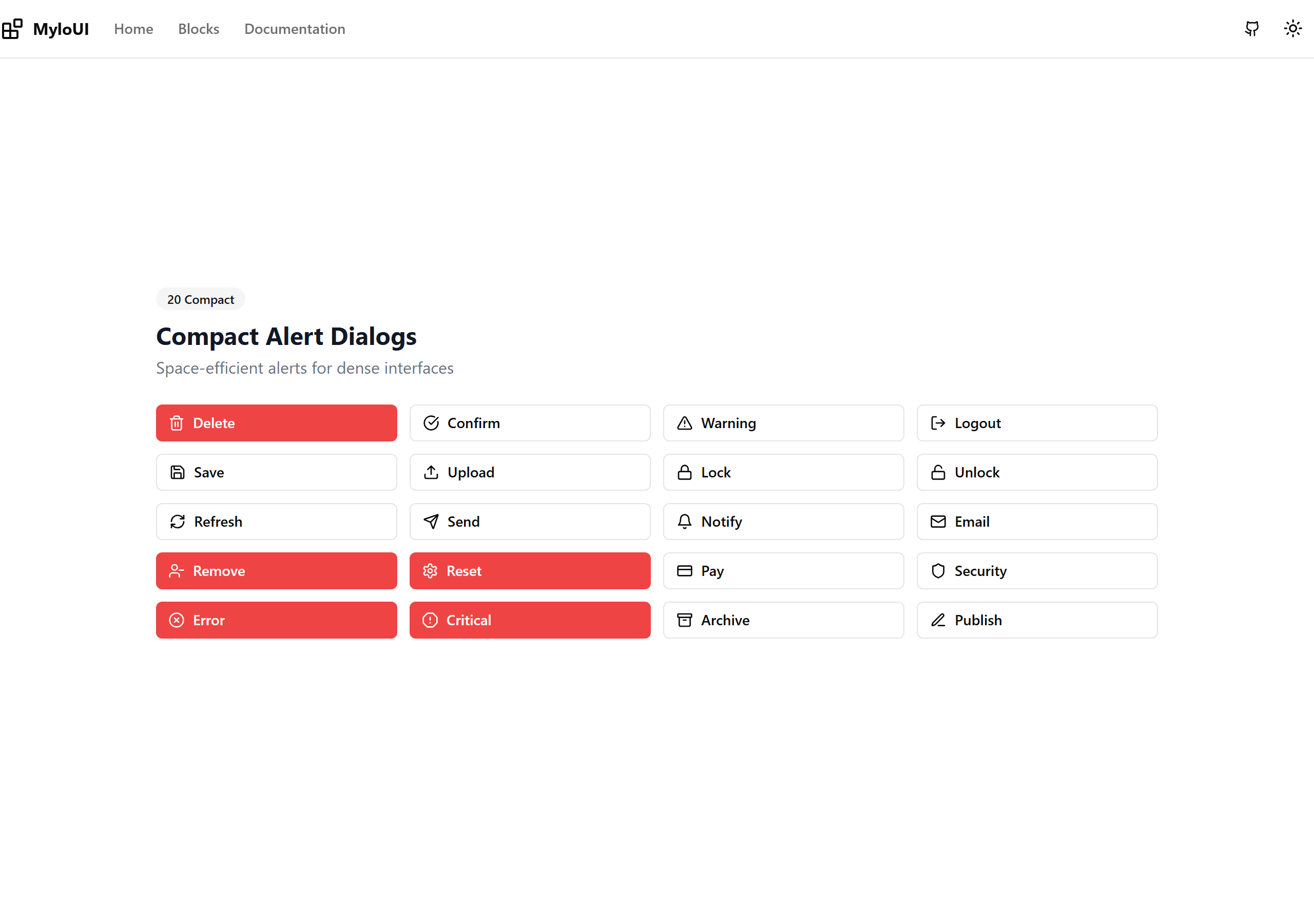
Alert Dialog Compact
20 compact alert dialogs for dense UIs
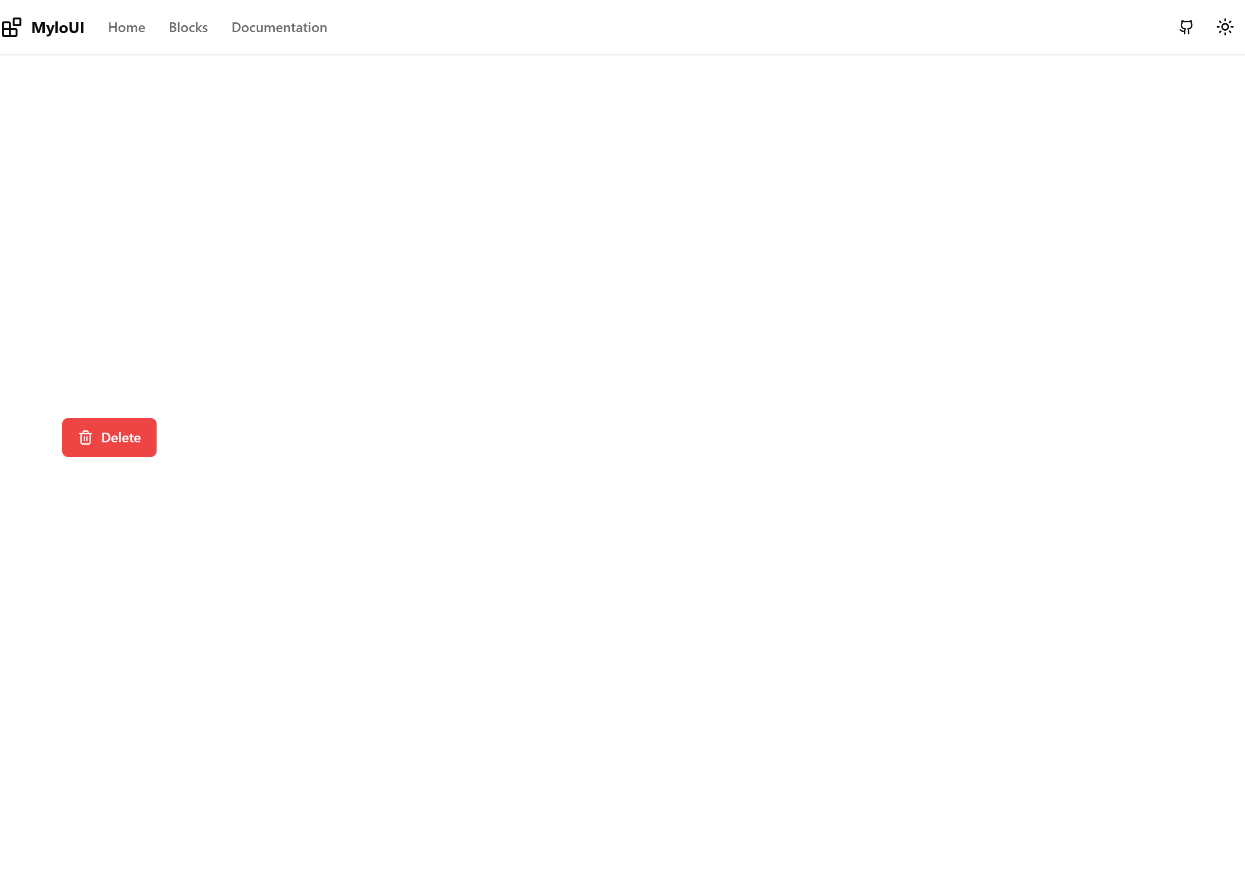
Alert Dialog - Delete
A confirmation dialog for delete actions with destructive styling
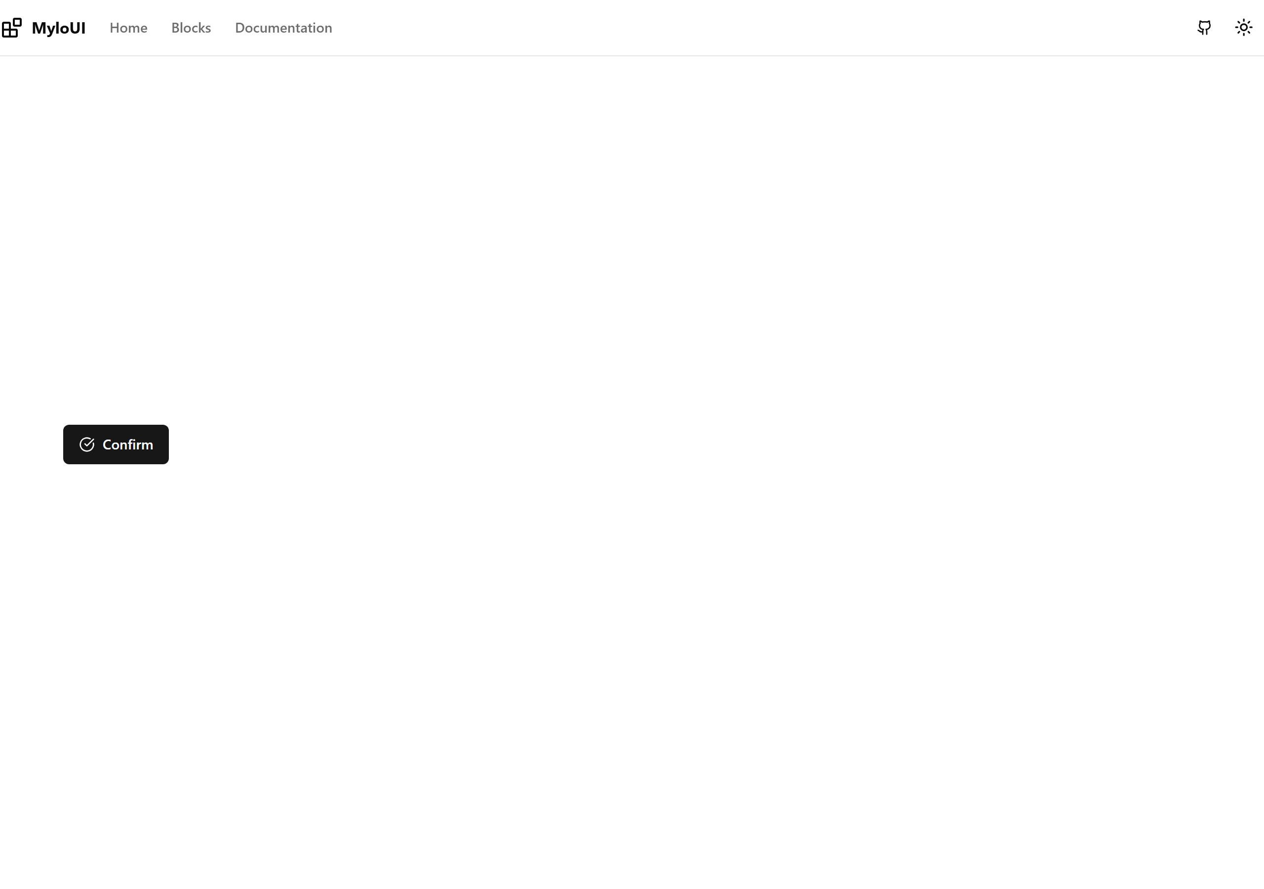
Alert Dialog - Confirm
A general purpose confirmation dialog with customizable icon
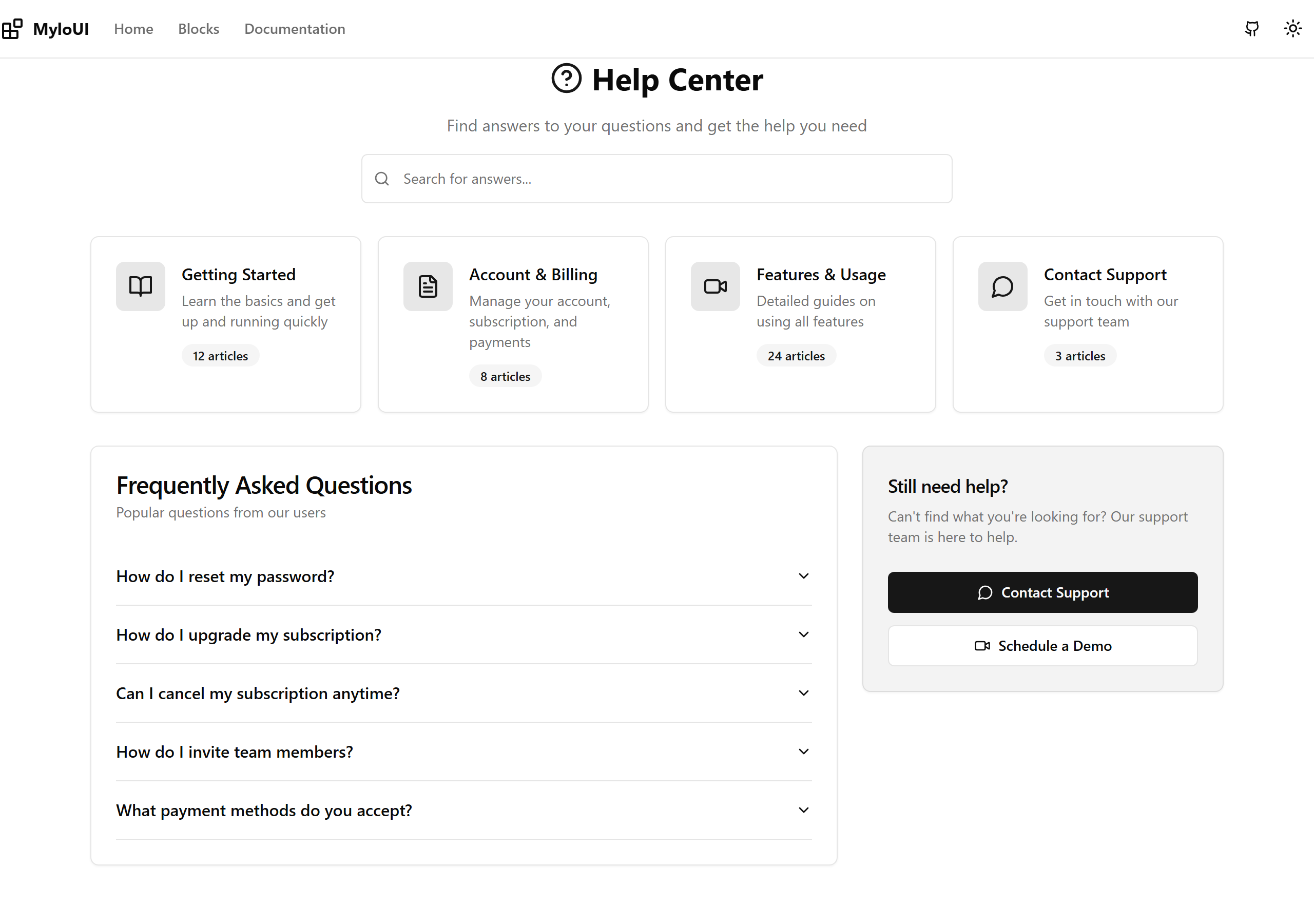
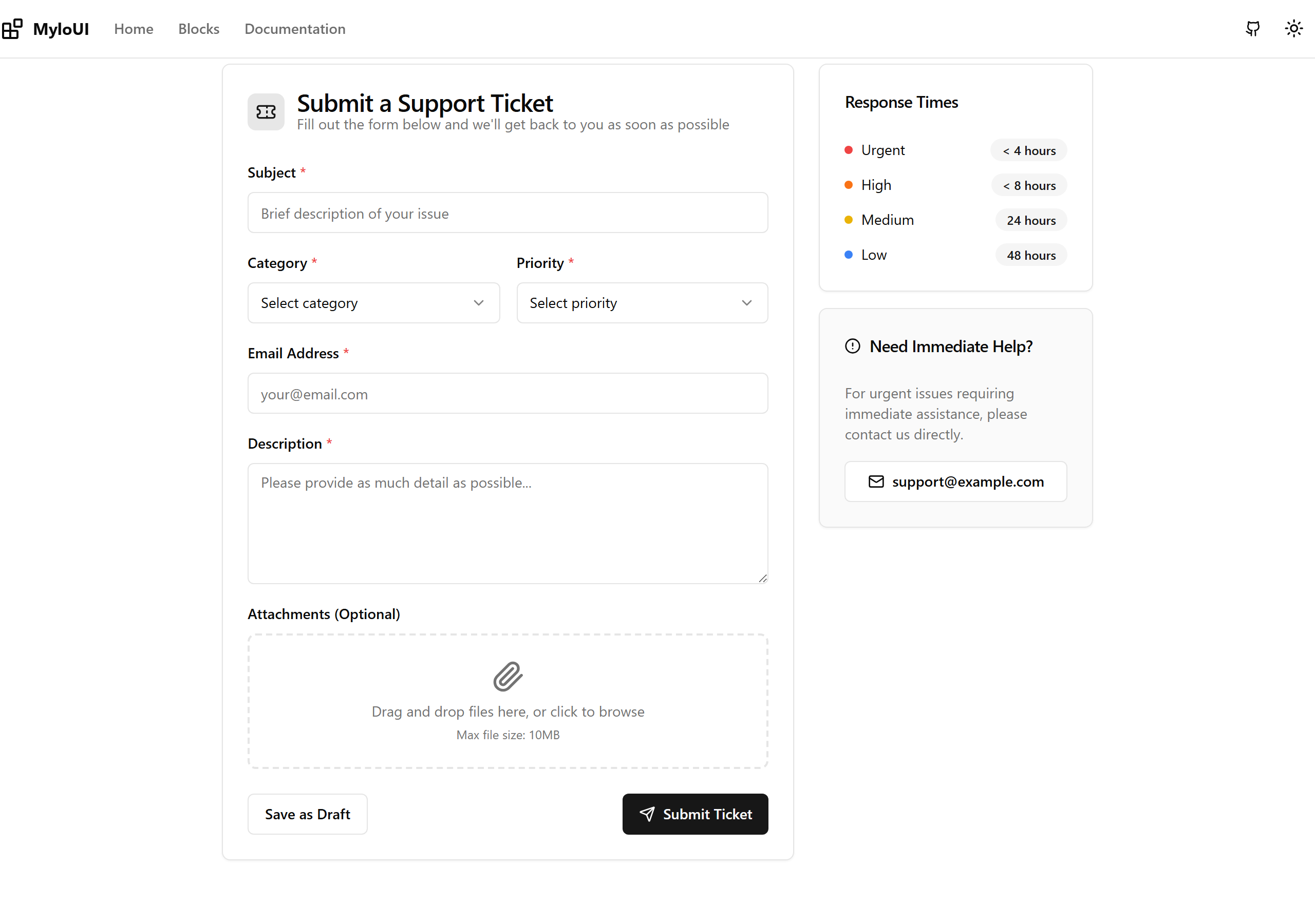
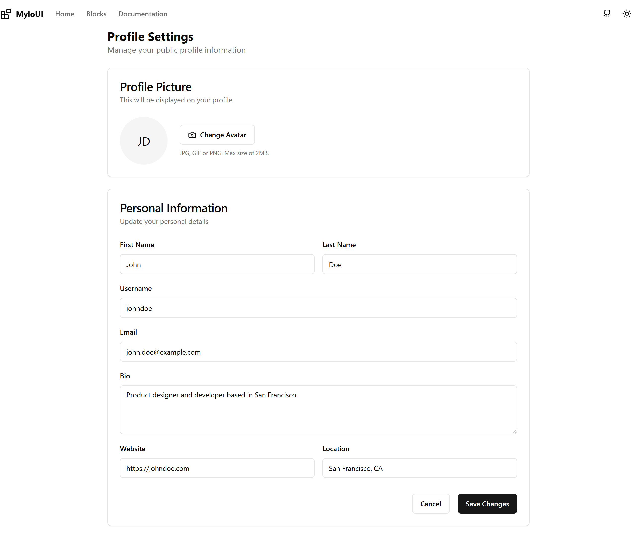
Settings - Profile
User profile settings with avatar upload and personal information
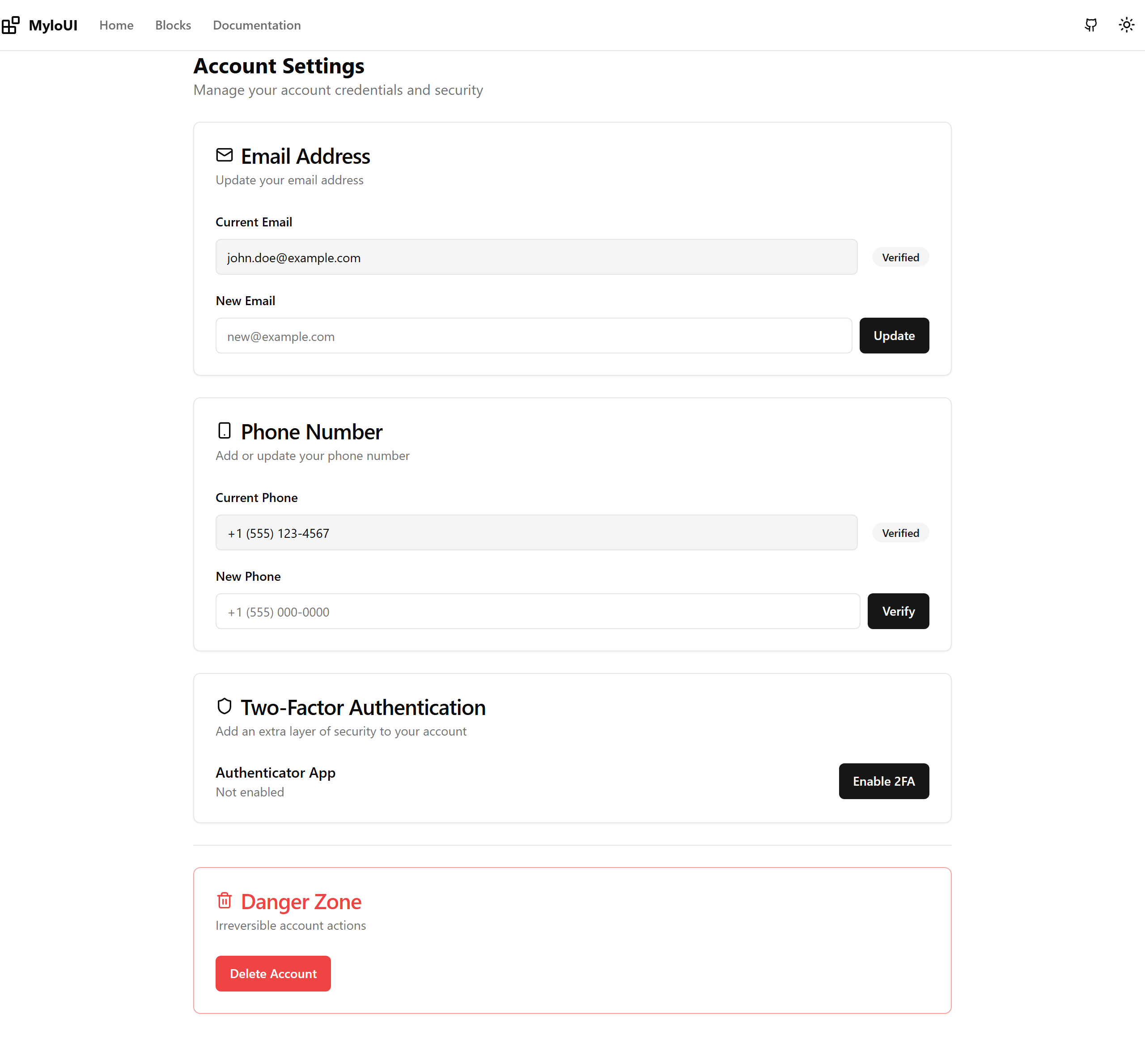
Settings - Account
Account management with email, phone, and security settings
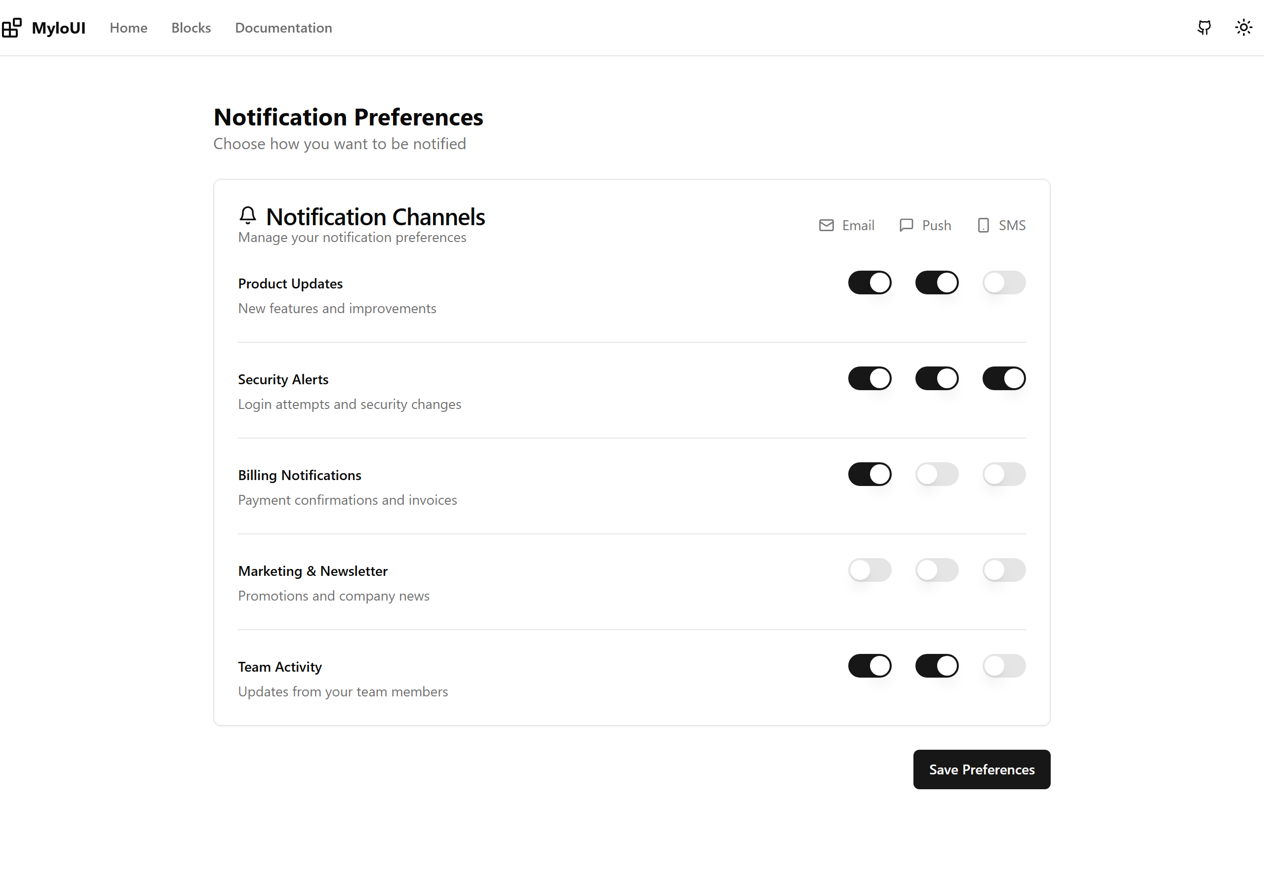
Settings - Notifications
Notification preferences with email, push, and SMS controls
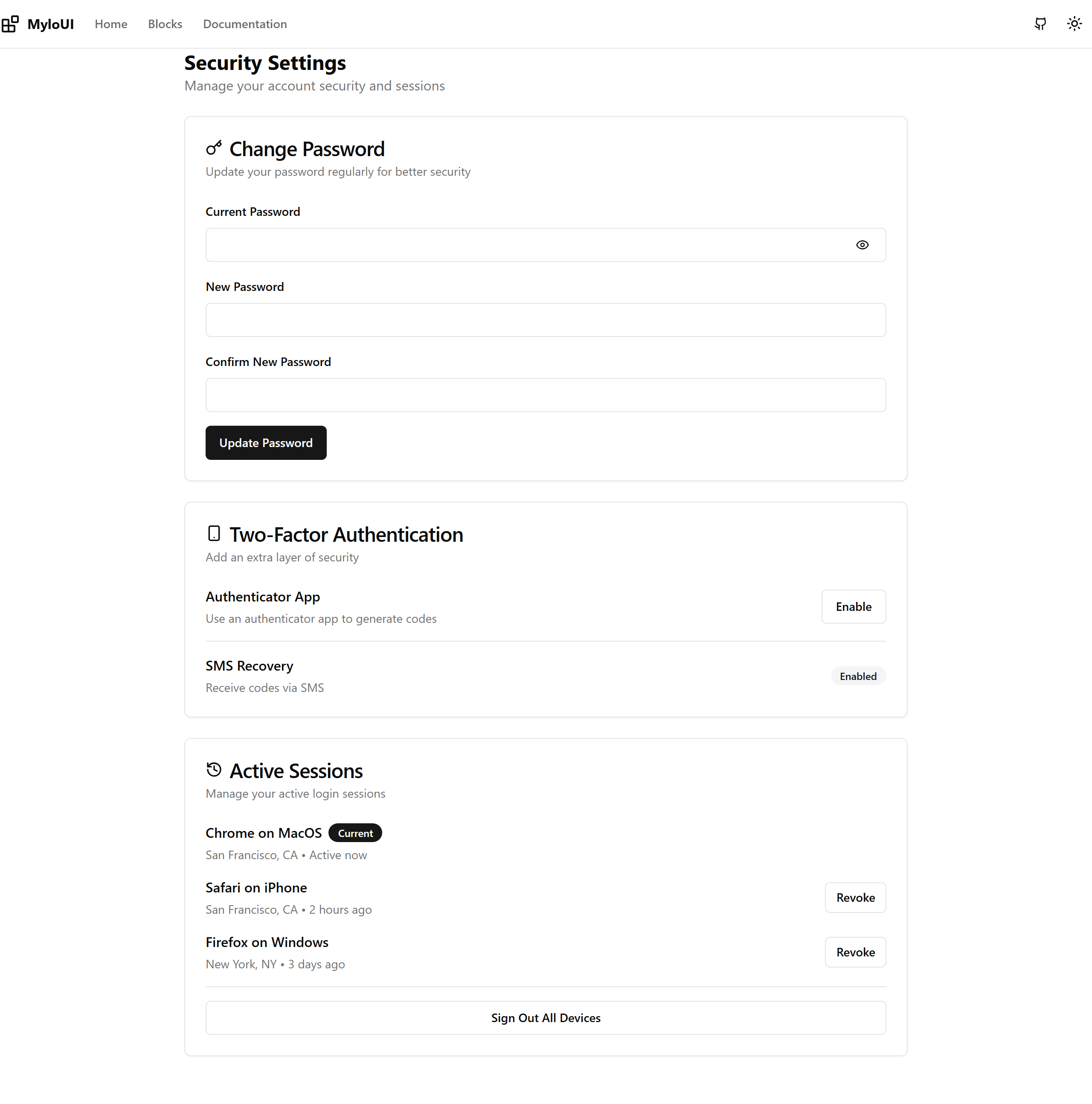
Settings - Security
Security settings with password, 2FA, and session management
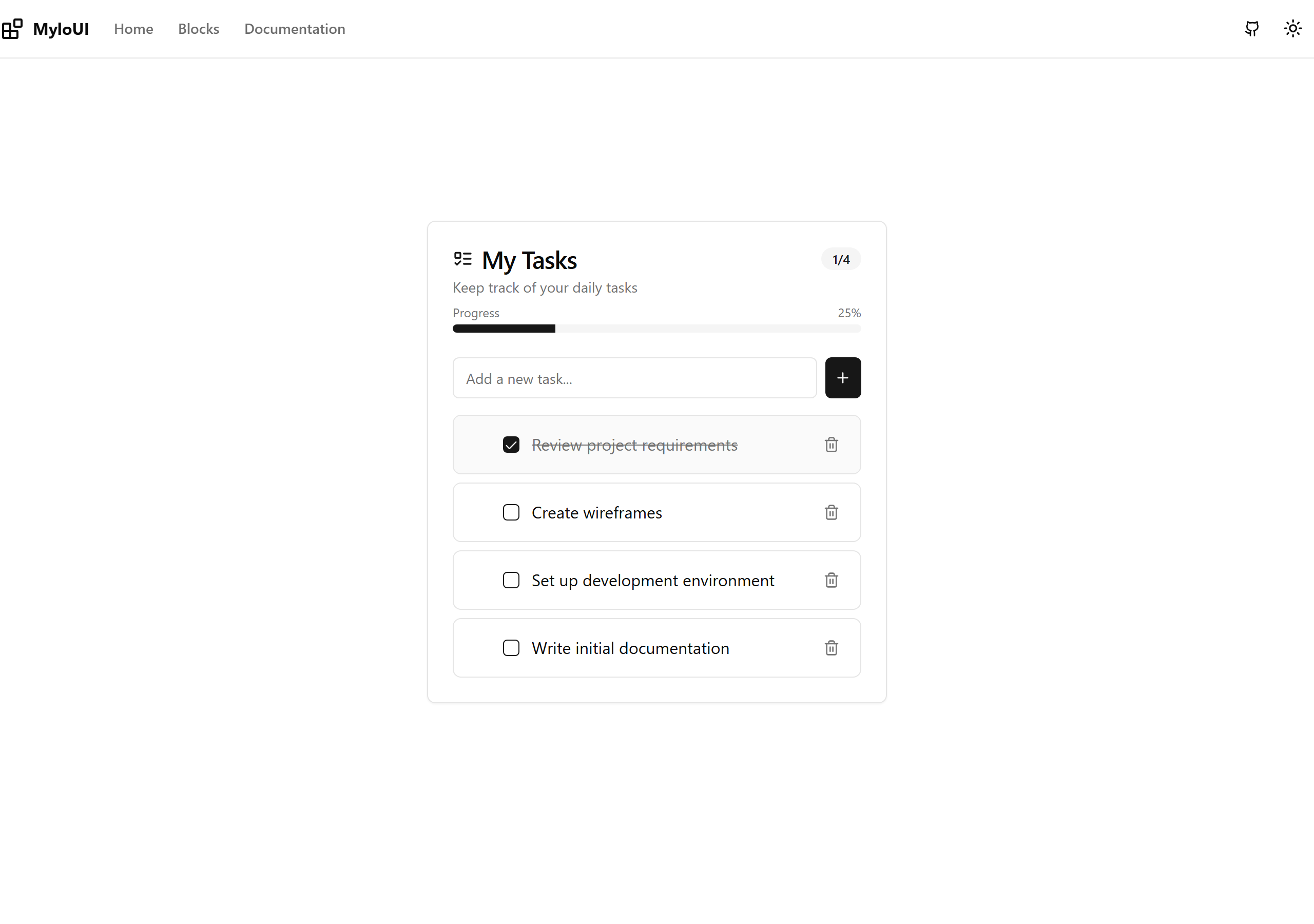
Todo List - Simple
A simple todo list with progress tracking and drag-and-drop reordering
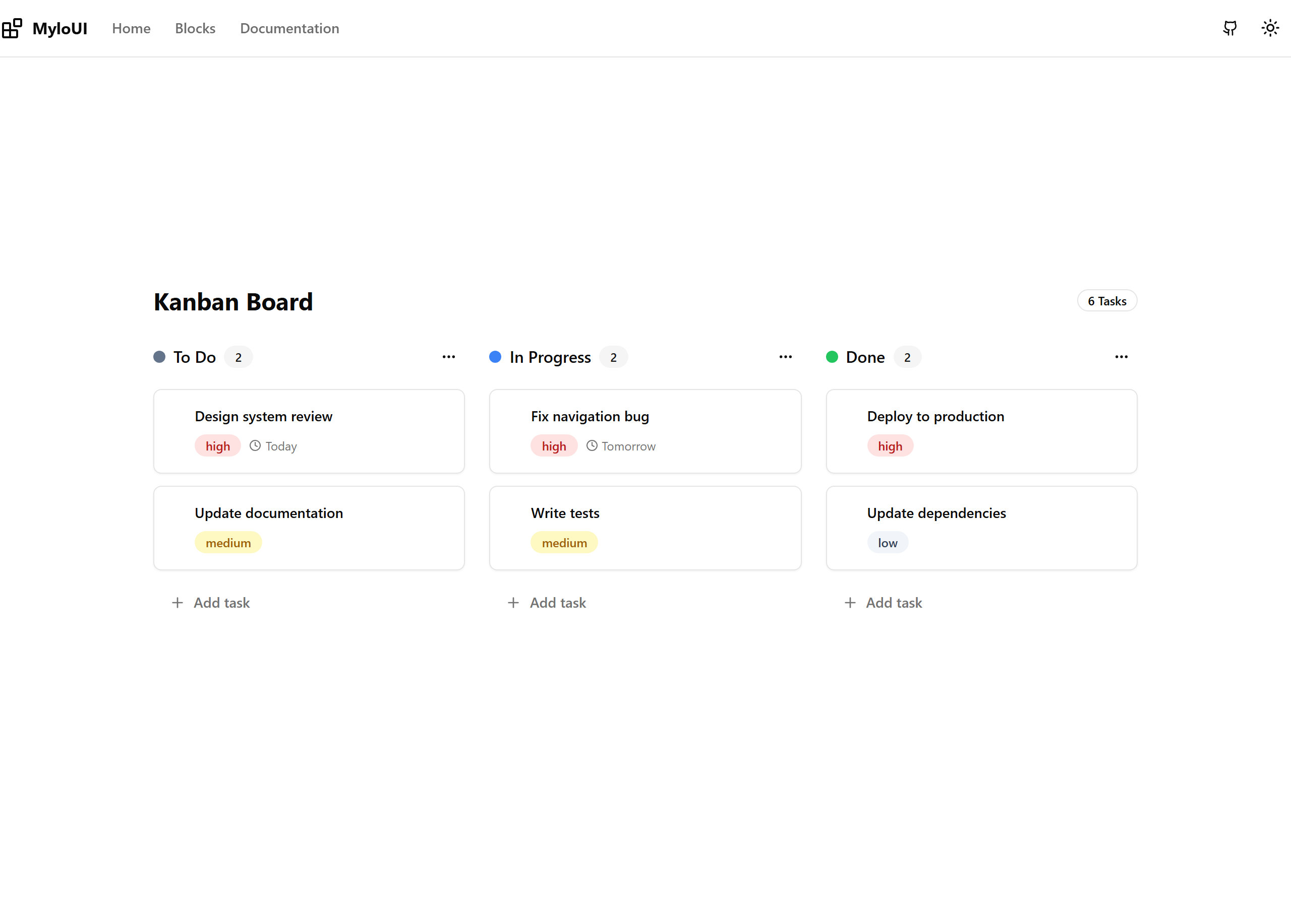
Todo List - Kanban
A kanban board style todo list with full drag-and-drop support for moving and reordering tasks
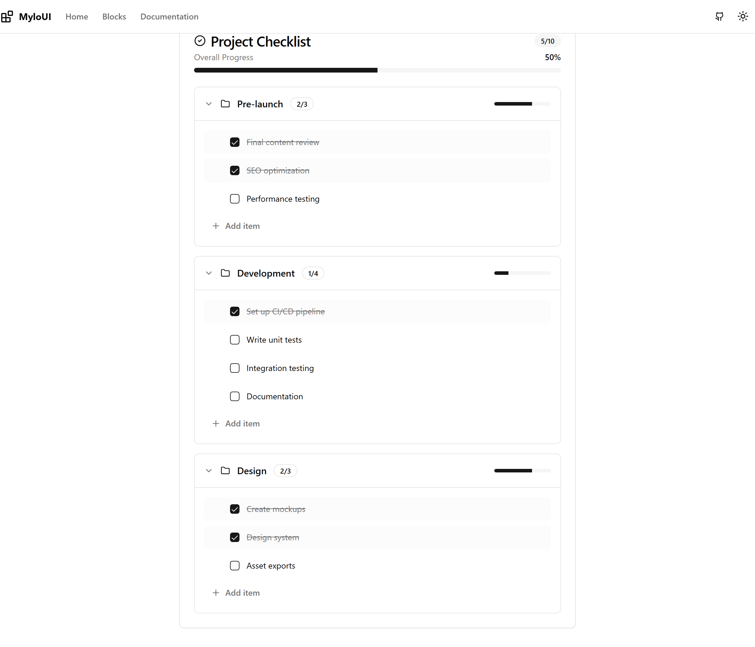
Todo List - Checklist
An organized checklist with categories, progress bars, and drag-and-drop item reordering
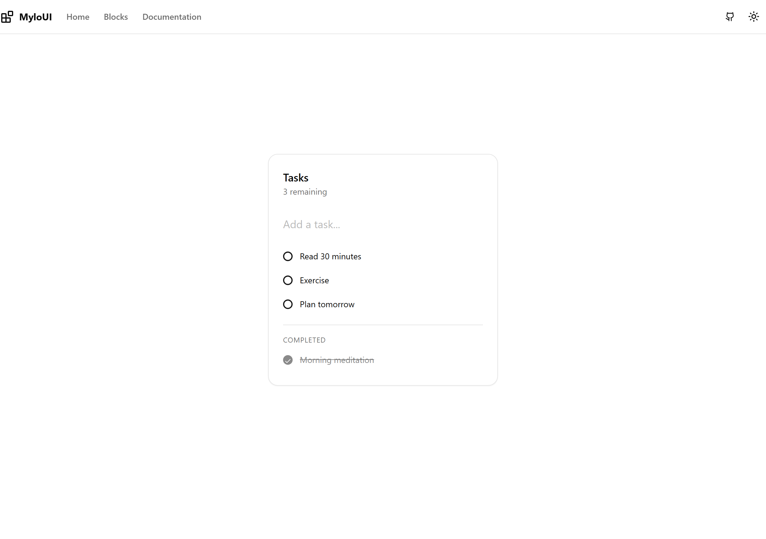
Todo List - Minimal
A minimal, clean todo list design